In our most recent webinar, Marketer’s Guide to Digital Dashboards, Cardinal Path’s panel of experts, which included Charlotte Bourne, Mark Tallman, and special guest Stephane Hamel, shared insights into some of the most common reasons why so many dashboards fail, and how to save yourself from these pitfalls to set up dashboards that deliver actionable insights for business users.
Judging by the excellent questions posed by our audience, many are looking for ways to get valuable insights from their dashboards. With multiple stakeholders, various data sources, and increasing pressure to ensure that the data & insights are actionable, one thing is clear: marketers feel challenged when it comes to delivering on the promise of dashboards.
Below are some of the great questions asked during the webinar, along with the answers.
1. We have a lack of non-vanity goals/objectives from our stakeholders. They want too much data. How do you arrive at a consensus on dashboard priorities?
A: Stephane Hamel: In a perfect world, you would have addressed the KPIs right at the beginning of the project, when defining the objectives. The reality is that this is often not the case. You could use an investigative approach and answer the 5W+1H questions – which will help to frame the needs & scope of your dashboard. I’m a fervent advocate of breaking something into smaller parts in order to gain a better understanding of it. If you can at least control the scope and start by agreeing on a single KPI, then you should go for it. There are many benefits to having a more agile approach with multiple iterations. You can call it a “pilot project” if you’d like, but whatever you call it, make sure that it gives you a “right to fail learn”! For one client, they wanted a very sophisticated dashboard which merged multiple data sources. By using this“pilot project” approach, we were able to scope it down and at least start providing value in a short amount of time. However, the real benefit came from standardizing the KPIs terminology, campaign taxonomy, and getting everyone on board. In the end, change management was actually the most difficult part, once we had that in place, building the dashboard was easy!
2. How do you identify the difference between ‘nice-to-know’ and actionable data?
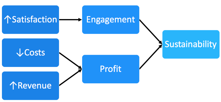
A: Stephane Hamel: KPIs are usually supported by additional metrics (eg. If you show “conversion rate”, the underlying “Transactions” and “Sessions” should be visible too. Keep in mind what is a “nice to know” might be actually be a critical component for someone else. The number of Facebook likes might be more important to someone who is operational, but could be only a ‘nice-to-know’ for your executive-level stakeholders. In the end, there are three ultimate KPIs: satisfaction (of customers, employees, investors, partners), costs, and revenue. To be considered a KPI, the metric should clearly tie back to one of those. Is “Number of Facebook Likes” a good KPI? I’m sorry to say this to you but, ‘it depends’. It depends on the answers to the 5W+1H!
3. I’m using Google Data Studio and trying to bring all sources – web analytics, email metrics, industry ad data and social media engagement all together into a dashboard. Any advice or experience on doing this?
A: Mark Tallman: Good question! There are a number of ways you can tackle this, but it all comes down to how you want to connect to your data. Currently, Google Data Studio can connect to Google Only data sources. This means Google Analytics, Google AdWords, Attribution, Big Query, YouTube, and Google Sheets. They recently announced a connection to Cloud SQL and MySQL databases as well. So, if you only want to connect to Google-owned data sources like Analytics and AdWords, just use the direct connector! If you want to use additional data sources like Facebook, Bing, Twitter, MailChimp, or others, you have to get crafty…you can either push that data into Google Sheets (less technical) or a database (Cloud SQL or MySQL) and pull it into the dashboard from there. You can either do this manually (export the data from each platform, then paste into Sheets) OR programmatically with something like Analytics Canvas.
4. Several people have said they are struggling with managing the needs of multiple stakeholders for a single dashboard. What’s your advice?
A: Stephane Hamel: Stephen Few defined a dashboard as fitting on a single page (or screen), but the reality is that it’s not always going to fit on a single page. It must, however, have consistency in the way you define and present the same KPI on different dashboards. Personally, I would aim to have a single dashboard even if it has to be larger – this way, all of your stakeholders are “exposed” to what is important for their peers, which can facilitate the growth of a data culture, and even spark interesting conversation, maybe even surfacing interesting ideas and solutions. To quote Stephen: “A dashboard is a visual display of the most important information needed to achieve one or more objectives; consolidated and arranged on a single screen so the information can be monitored at a glance”. -Stephen Few, Information Dashboard Design.
5. Which tool, besides Tableau, can you recommend that will allow me to pull in social and web analytics data side by side? The trouble with Tableau is that it’s hard to share dashboards since licenses are required to even view these reports.
A: Charlotte Bourne: If you have programming skills or developer resources you can leverage programming languages like Python and various R packages to access the different APIs. The challenging part with those processes is often the authentication step, which can be harder than creating the actual data pulls. Other advantages there are that you can use those languages for data cleaning and wrangling, to join your data sets and to push it into a final format.
If you don’t have programming skills there is quite a market for various connectors. You’ll find a whole range of Excel-based connectors that allow you to re-pull and refresh your data quite quickly. A few options in this area is Next Analytics, Excellent Analytics, Supermetrics, etc. These serve as easy entry points for non-technical resources and have different capabilities with respect to data sources you can access.
Also keep in mind that Tableau dashboard creation requires a licence but Tableau dashboard viewing does not. There is a free dashboard viewing tool called Tableau Reader which allows end users to access the dashboards you create with all of the same interactive functionality. (This would be like the difference between Adobe Acrobat vs. the Acrobat Reader).
Some other options are Klipfolio, PowerBI, Google Sheets, and Google Data Studio, but all come with their own advantages and limitations.
6. What are some examples of companies that provide ETL (Extract, Transform, Load) software?
A: Charlotte Bourne: Analytics Canvas comes to mind (specialized for Google Analytics), Informatica, Talend (open source) or Pentaho (open source) are other well known vendors. There is a Gartner magic quadrant for this as well.
7. We have many data sources, so the big obstacle is automating the data extracts while not yet having a centralized, managed data mart.
A: Charlotte Bourne: I really understand this challenge. You’re looking to get as much automation as possible to have an efficient update process which is difficult as the number of datasource increase. If a data mart build isn’t a good solution, I would do a gap analysis. First, on the data side: what kind of automation can come from the data platforms you currently use. Look into what automation you have available to you in terms of scheduled reports and report formats. Does that give you sufficient data for your dashboard? Are additional joins or data cleaning needed?
At this point, you should think this through from the dashboard visualization side. What automation features are available through your dashboard tool? What data connections are available?
Finally, look at the gaps. If you find that you cannot get to the degree of automation and efficiency using the native capabilities of your data sources, and your data visualization tool alone, that’s when you should start evaluating a data integration tool or ETL tool in order to bridge that gap. That allows you to then work on streaming your dashboard process without resorting to the all-out step of building a datamart to support your dashboard project.
8. Does Cardinal Path offer this software?
A: Charlotte Bourne: While Cardinal Path doesn’t offer the actual dashboard software, we do partner with leading vendors like Tableau and Klipfolio and provide the services to pull in data, define KPIs, enable integrations and automations, conduct analyses, and ongoing reporting in order to draw out the insights that matter and maximize return on a dashboard investment.
9. I’m using Google Analytics but before to plug the data into my dashboards I need to modify them using Excel CSV. Do you know if there is way for the data to be automatically modified before I plug them into my dashboard?
A: Mark Tallman: Yes, Analytics Canvas! It does however, depend on which transformations you’d like to make. Most of the time, you can skip Excel completely.
10. Does Analytics Canvas connect to Google Data Studio?
A: Mark Tallman: Not exactly. In Analytics Canvas, the best path forward to connect to Google Data Studio would be to export your dataset into Google Sheets and use that as your point of connection into Google Data Studio. There is no direct connector, but the currently available output formats can still fit the needs of Google’s product.
