Editors note: Back in March, Stéphan Hamel started a series on his blog about the math behind web analytics. Then in April, he joined us at Cardinal Path and began posting on our blog. Over the next few months we plan to release several posts on the math behind web analytics. We continue today with the second post from his blog.
In the second installment of this series, we will leverage Excel to take over where Google Analytics left us.
1. The math behind web analytics: the basics
Basic charting in Excel
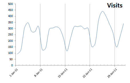
There are already some striking things: peaks & valleys corresponding to weekdays and weekends, and a week apparently performing better than others. Now we can easily apply some basic statistics on our time series.
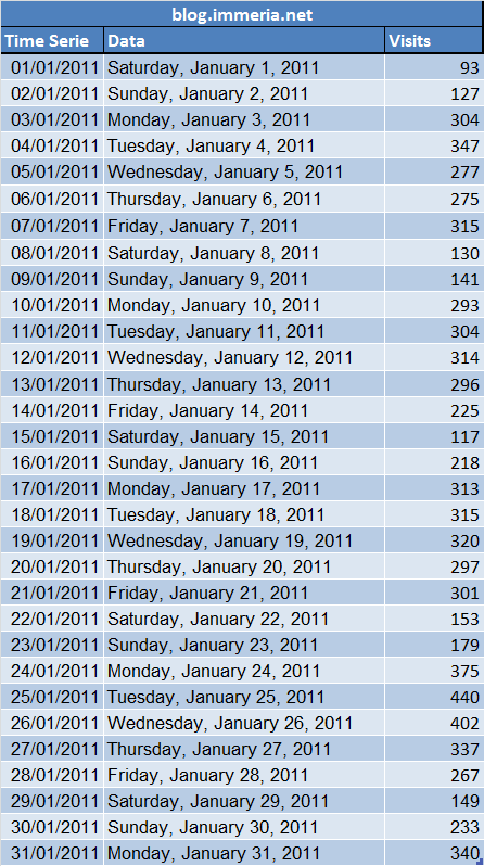
Mean
The mean [wikipedia] is often referred to as the “average”, which, in reality, is the “arithmetic mean”. This is very simple math: add all the numbers and divide by the number of data points.
Look at Figure c – what can you tell about the red line crossing the whole graph? In a time series like daily visits for a month, honestly… we can’t tell much! Yet, only averages are reported by most web analytics tools – so please, don’t even bother saying “the average number of visits this month was X”!

Learning point: The average is rarely a good indicator in a time series such as those found in web analytics because it is influenced by extreme values (known as outliers [wikipedia]). At best, in the case above, one might want to calculate the mean for weekdays and the mean for weekends. As a rule of thumb, if you have less than 30 data points, use the median.
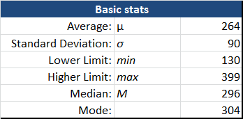
Figure d: descriptive statistics
Median and mode
The median [wikipedia] is the middle value. The mode [wikipedia], on the other end, is the value appearing the most frequently. Again, in a time series, where the spread of values (the standard deviation explained below) is large, those descriptive statistics [wikipedia] (Figure d) are usually of little interest.
Min & max
The min and max values are… well.. the maximum and minimum values in a time series. Those could be qualified as “anecdotes” – we could be thrilled we’ve got so much traffic on a single day, or deceived by a poorly performing day, but knowing that has absolutely no value if we can’t explain why.
In the time series used in this example, the min value is 93 visits on Saturday, January 1st. What can we tell about that? Obviously, people were busy doing something else than visiting my blog. What happened during the 4th week, around January 25? I shared my views about our little web analytics community and recounted my contributions. In both cases, we have very plausible explanations and the min & max values were useful only because they made us ask “why?”.
Trend
To me, the linear trend [wikipedia] (shown as a dotted line in Figure b) is one of the interesting modeling stats because it marks the begining of our regression analysis [wikipedia] capabilities – our ability to explain the why’s and “this, therefore that”. Basically, it can help us do some predictive analytics (albeit very simple). Remember y = mx + b? That is, the position of a point on the y axis (the visits) depends on a factor of x (the day) plus a starting baseline. I can tell, based on historical data, that I should get approximately 350 visits next Tuesday.
Standard deviation
If we do max – min we get the range [wikipedia], another descriptive statistic. Interesting at best. What’s much more interesting is the standard deviation [wikipedia] – the variability of the data. As we’ve seen, the average isn’t of much use because it is largely influenced by outliers. Standard deviation gives an appreciation of the spread of values around the mean, or if you prefer, the variation in a distribution of values.
Why is this important?
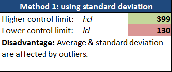
Figure e: control limits at +/- 1.5 sigma
First because standard deviation will be used to set control limits [wikipedia] (Figure e) – which in turn will be useful to define our tolerance and targets (covered in a later post). While control limits are typically set to +/- 3 times the standard deviation from the mean – I have found +/- 1.5 times (for a total of 3) to provide a better and easier indicator of values going below or above our historical track record (shown as the grayed area in Figure b). Basically, it gives us an easy way to set alerts when our metric might be going out of whack!
Secondly, a large variation is an indication of an unstable process (think conversion rate), or low reproductibitiliy (anecdotal campaign success), or if you prefer, a larger standard deviation reduces our ability to predict the value of Y given a certain X. Basically, as analysts, we want to explain the past, but we also want to provide insight on how to fix issues and seize opportunities – we eventually want to be able to predict outcomes of our recommendations.
Coming up: normal distribution, histogram and box-plots
In the next installment we’ll look at what is an histogram as well as normal distribution and their impact on our analysis. Also, although nifty spinning 3D-shadowed-shiny-Flash graphs are impressive… we’ll look at box plots elegant simplicity yet powerful and under-used visualization tool.
What do you think of this series so far? What would you like to see discussed or any examples you would like to see?

