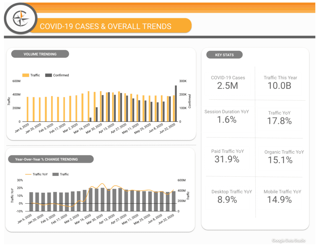
Data visualization tools, or dashboards as we’ll call them, are becoming increasingly popular as organizations look for ways to cut through the noise of their data and glean some insights that will help give them a business advantage.
Data can be visualized and connected to almost every platform there is – through APIs, custom connectors or even Google docs. Some people are surprised to find that this leads not to actionable data but just more data ‘noise’. As the technology become more user-friendly and even the least technically savvy among us are able to access and analyze data, dashboards are being used to varying levels of success within organizations.
The opportunity to view complex information in a visual format cannot be underestimated. Giving business leaders the ability to track the health of their organization through a single interface that presents Key Performance Indicators (KPIs) to drive decision-making? This is using data as opposed to drowning in it.
But there’s some serious legwork to do before you start picking out the color scheme for your dashboards. If you really want to make something of your enterprise data – and who doesn’t? – focus on the goal of providing the right data to the right person at the right time. Here are some of the ways you can ensure a winning dashboards solution:
 1. Define your Key Business Objectives (KBO).
Simple stuff, right? Not always – These undoubtedly will vary by department and stakeholder level. For example: Accounting will be concerned with COGS (Cost of Goods Sold) and cash flow, sales will focus on conversions, and marketing will be measured on leads and loyalty.
You’re going to have to define the 3 or 4 big drivers of organizational success: the overarching business development goals. These are going to look something like the following:
Grow revenue by 30% while maintaining current margin
Build reputation for quality of product and consistency
Grow service department by 20% in 2014/2015 fiscal
Once you get a sense for your KBOs, get aligned. We’re not talking about a chiro appointment. Get buy-in and approval from the key players on these 3-4 overarching goals.
 2. Identify the key drivers or initiatives that map back to the KBO.
At the very least, your Key Performance Indicators (KPIs) need to roll-up to drive the KBOs. That’s the price for playing. Defining goals by KPI is a close second.
The supercharge lies in the time you put into creating a matrix which sits on top of KPIs that map to Audience Segmentation and Marketing Initiatives. KPI Measurement Frameworks is a whole other blog post, however, the better you can define marketing initiatives alongside segments, the more powerful this exercise will be for you. This changes the conversation from “Our page views and facebook likes are up 5% month-on-month” to “Our spring campaign for our pre-loyal customer segment is at 95% of target”. All of a sudden you look like a rock star.
 3. Identify your audience. Choose a tool that suits their needs.
Having business-critical information in hand is going to make your life a lot easier. There are a lot of people who fall into the trap of picking the tool before fully understanding the job. This is incredibly unique to the web and tech world. The biggest factor in choosing the right tool for your dashboard is the user who will be acting upon the data being displayed. No analysis is worth doing unless it fuels some sort of decision.
There are a lot of business intelligence tools out there that cater to specific audience groups and you will have to identify which of these works best for your organization. Some of the leading tools include:
- Tableau – a great tool if you want your users to be able to dig in and get their hands dirty with the data.
- Klipfolio – provides a wonderful “hands off” presentation with a beautiful interface. Check out this free trial of the Klipfolio dashboard.
- Adobe Analytics inherent dashboard – Allows quick shortcuts into underlying reports for further analysis – shareable and can include external data sources
- Google Analytics inherent dashboard – has the familiarity of the GA interface and instant connectability.
These are just a few and there are many available so it’s worth spending some time on this, taking advantage of free trials, and really doing your homework to find the tool that is right for your business.
 4. Divvy up those KPIs into manageable data segments.
Regardless of which tool you choose, you’re going to have to make API calls to your data sources to pull that data into your dashboard. At this point, stop thinking in terms of data source and start thinking in terms of data segments. Take Facebook for example: this is one solitary source of data, but you may pull multiple segments of data from that single source. Looking at your KPIs you may have an increase of subscribers from last month as an indicator of success for you. You’re going to have to pull data from this month and last month. These are two separate segments. Data can be segmented by any number of variable things such as time, traffic, audience, dimensions, filters, or anything in between.
The best way to avoid “development hell” is to use your KPIs as a blueprint for all of the data segments you’re going to need to pull together using the various services APIs. At this point you may also figure out that the assorted services keeping your data in silos may not be as accessible as you thought. Not all the services you’re working with may have API accessible data and there may be additional costs involved. Better to find all this out now before you commit time, effort, and money into an under-delivered outcome.
 5. Test those data segments to ensure data is clean and usable.
Translating your KPIs into data segments will serve as the foundation for your dashboard. After all, your dashboard is useless without data, right? Your list of data segments run some manual calls against them to ensure the data is what you expect. Keep an eye out for a few key things: do you have to make a lot of data segments to pull that data you need? Your data might be too fragmented. Do you have to do a bunch of crazy workarounds to get the right data out of the API? Your data may be dirty or disorganized. Is your data vastly different than what you expected? Your data could be inaccurate or the service you’re connecting to isn’t functioning properly.
Running a manual pull on these data segments will surface these issues. Every workaround and hotfix you put into pulling the data out properly is merely treating the symptoms and not diagnosing the disease. Time to take a step back and find out what’s happening with whatever service you’re connecting to and fix those issues. Nobody wants to make important decisions on bad data.
 6. Determine the visualizations.
This is the best part of creating a dashboard. You’ve done your due diligence. You know the objectives from your KPIs. You chopped up your data into reasonable segments. You took those segments and ran them through the ringer and scrapped anything that wasn’t feasible. Your team is on board and your client or boss knows exactly what to expect. Creating visualizations is making data sexy. Take its dorky glasses off and shine a spotlight on it. You want to choose a visual representation that will look amazing, convey your message at a glance, be easy to understand, and most importantly create action.
This is without a doubt an iterative process. You’ll probably take a few stabs at what works best with which data. Try not to get too bogged down with what’s perfect, you’re just messing around with the look and feel and most dashboard products out there should allow you to comfortably make changes to this without a ton of labor involved. The hard part is getting the data in line and that should be all done by this point. There are entire websites dedicated to what kind of chart to use for a specific type of data so we won’t get too far into it. Go with your gut and if you want to take it up a notch, bring in a designer to help you out.
 7. Integrate dashboards into your analytics process
Remember that alignment we made you get back in step 1? This is where it pays off in dividends with your KBOs defined, KPIs that roll-up to visualized goals, and now you have the exciting task of unveiling your hard work.
Remember – dashboards are living, breathing entities. Maintenance, check-ins with stakeholders and realignments are necessary. Don’t let your hard work fall victim to the next shiny object. Drive continuous adoption by making it relevant and current. Dashboards may be the “it” thing right now, but displaying business metrics is a constant need. Review your measurement framework and KPIs often, and communicate via your dashboard as much as possible.
 Let’s recap.
If overwhelmed, start with a solid foundation by identifying what success looks like to you, your company and your department. Map out your visualisations by KPI and dive into the connections. Once you get rolling, you’ll see the magic start to come together and the dashboard take on a life of its own. The tools are getting friendlier so you don’t have to be a technical wonder. The bulk of the project is about defining goals and metrics, aligning stakeholders, and getting the data in shape for its enterprise debut. As with any technology deployment, start with the end in mind.
 1. Define your Key Business Objectives (KBO).
 2. Identify the key drivers or initiatives that map back to the KBO.
 3. Identify your audience. Choose a tool that suits their needs.
 4. Divvy up those KPIs into manageable data segments.
 5. Test those data segments to ensure data is clean and usable.
 6. Determine the visualizations.
 7. Integrate dashboards into your analytics process
 Let’s recap.