Data visualization, dashboards and visual business intelligence are hot topics. It seems everyone wants to set up a dashboard, create stunning infographics and use visuals for everything from informing prospects and customers, to facilitating the strategic work of their executive staff.
But not every organization is set up to make their desire a reality. Most organizations place a high priority on getting better at understanding data that is collected from a complex array of different sources. By merging these into a comprehensive analytics reporting framework for better manageability and control, they can gain a clear line of sight into the impact of marketing spend across all channels.
Few organizations adequately plan for delivering their insights in easy to-access-and-evaluate formats and end up falling into some common traps:
- Paying for tools and analysis many times over, which drives up costs, reduces flexibility, increases turnaround times and too often, yields only partial results.
- Increasingly siloed data with no consistent plan or activities to bring it together in an efficient manner (sometimes this manifests itself as a tedious, manual process with overly complex spreadsheets).
- Lack of knowledge transfer and capacity-building radically minimizes ROI from hard-won marketing technology investments.
Loss of productivity, as internal and external stakeholders find it difficult to collaborate with each other to gain a collective perspective via a single source of truth.
Organizations with high performing data analytics programs, on the other hand, operate from an integrated data perspective. They are able to select the most relevant and actionable streams of data from different data sources–in multiple formats– across disparate vendors and internal data islands, to truly see their organization’s “big picture.”
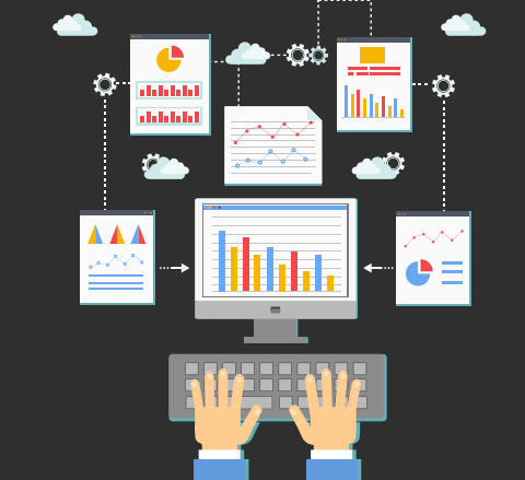
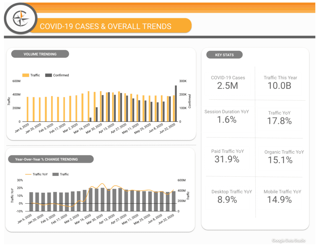
More often than not, this window into ongoing progress of various organization-wide initiatives is a dashboard–or collection of dashboards–in the form of integrated data visualization tools. These dashboards support meaningful analysis and evaluation of marketing effectiveness on a consistent basis, through easy to understand graphic representations.
- Decide to act. Dashboards can help business leaders monitor the health of their organization, through a single interface that presents Key Performance Indicators (KPIs), in a way that enables sound short-and long-term decision-making.
For many organizations, this represents the first step in actually using all their data rather than simply collecting and then drowning in it.
Dashboards can help improve both performance and the decision-making process, and can make complex data inviting and accessible with low barriers to entry. But the first step is deciding to make them a part of your plan.
- Find an internal champion. Ideally you will already know who in your organization is sold on the idea of using data to drive business decisions.This person or team will take a dashboard project and run with it, with the goal of winning small victories and then replicating successes across the broader organization.
- Identify objectives. Meet with your champion and his or her team for a session to identify the group’s business objectives. Map those objectives to measurable KPIs.
- Map those objectives to measurable KPIs. For instance, if a business objective is to “improve customer retention,” you might choose to measure a group of KPIs that collectively provide a good measure of how you are performing in this realm.
You would be looking at a combination of things like repeat visitors to your site, repeat purchasers on and offline, email unsubscribe rates, average time between purchase, loyalty card adoption, social sharing, and anything else that can contribute data points, all of which combined, paint a picture of performance. Repeat this exercise for each of the defined business objectives.
[Why wait? Take the first step by visualizing your own Google Analytics data with this FREE trial from Klipfolio]
- Find your data. Obvious places to look will be web analytics data sources, CRM systems, email solution providers, social media-monitoring solutions, internal sales data and any other sources you can add to flesh out KPIs.
- Figure out the locations and formats of your various data points. Some will be available through APIs (application programming interfaces), while others may live in databases or reside in flat files.
- Sketch out what your dashboard will look like. Many of the best, most usable dashboards literally start with a pen and the back of a napkin. But keep it simple and avoid the temptation to over-complicate. Remember, the whole point is to provide an at-a-glance decision-making tool. This is also the time to choose the right visualizations for the data you are surfacing. Perhaps you need to simply look at trends (line graphs over time) or maybe you need to compare geographies (geographic heatmaps), channel sources (bar graphs) or simply track progress to a goal (gauges and success meters).
And don’t forget to organize related data points into thematic tabs or sections, i.e., an “impact from social” tab or a “repeat customer activity” grouping.
- Make the back of your napkin a reality. You can use anything from spreadsheet applications to very expensive tools and professional services implementations. A common place to start is with one of a host of third-party tools, that can quickly connect to common APIs and data sources. These enable you to choose from a variety of visualizations, and allow you to lay them out in an easily accessible, Web-based interface without too much technical know-how.
- Show it off. A dashboard is only meaningful if people use it. Be sure to promote and disseminate to everyone who stands to benefit from the data. Dashboards can be a very career-boosting initiative and you’ll be in a good position to help other departments take their first steps into data-driven decision-making, as well.
- Play, experiment, and refine. Dashboards are living assets. New business objectives and KPIs will surface as you gain sophistication and as technologies advance. Don’t be afraid to revisit the data, the sources and the visualizations, to ensure that your dashboards are relevant and useful. Like anything else, building a dashboard is a mix of trial, error and improvement. But with these tips and the awesome array of data visualization software available—including Klipfolio, Tableau, Qlik, Domo, Bime, and more— you’ll be well on your way.
[maxbutton id=”33″]
