You can’t help but feel good knowing that you just made a difference in somebody’s life.
But have you been through to the process of making a donation online and decide to turn away because you felt like you weren’t sure where your money was going? Or have your come across donation forms that just ask way too many questions, that you decide you didn’t want to write down your life story?
If you’ve made an online donation before, you probably know what I’m talking about. If you decide to run your own campaign to raise money for the Japan earthquake and tsunami relief, here are the top five points you need to keep in mind when you’re designing your landing page or donation page:
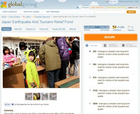
- Use a persuasive image. “A picture is worth a thousand words.” Using visuals will help convey the message of where the donor’s money is being put towards. Use real life images that would resonate with the individual and persuade them to make a donation.
- Give options to the donor. Often times, online donation forms forget to provide donation options (using radio buttons) and simply ask you to ‘Enter the amount you’d like to donate here’. The key here is making it easier for users to choose how much they’d like to donate, instead of asking for them to think up an amount. You never know, if your minimal amount is $25 and their intentions coming to your landing page was to donate $10, they may choose $25 because it’s listed as a choice.
- Make it shareable. If you are not in the social media game yet, be prepare to play. Not only are people sharing stories across social channels like Facebook and Twitter, but donators leave self-reflected comments which then sparks a conversation on the web. Some of the buttons that you should include on your donation page are: Facebook Share and Like, Twitter Retweet, and Email. Making the effort to add these social signals will go a long way for your campaign’s visibility and longevity.
- Keep your form short and sweet. No one enjoys filling out long forms. Design for minimal scrolling and keep the entire donation process to as few pages as possible.
- Make your button stand out and alive. I see many instances where donations forms ask me to ‘Submit’ my donation. How does it feel when you are asked to ‘Submit’ something? How about I ask you to ‘Donate’ to Japan? It sounds better already right? Use lively words like ‘Donate’ or ‘Give’ in your button to show that when they click on it, their money is going somewhere they will feel great about.
Here is one example of a donation page for the Japan relief by GlobalGiving.org.
These are of many points to keep in mind when you are optimizing your donations page. Often times, you will need to test different page layouts (A/B testing) to come to a conclusion on which page layout performs better.
Read more about non-profit organizations on cardinalpath.com
Have effective donations pages made you more likely to contribute to a worthy cause? What aspect sealed the deal?


