You’re an advanced Adobe user. You know when to use Adobe Analytics, when to head over to the Data Warehouse, and when it is best to tap into Ad Hoc Analysis. But when does it make sense to pull your data into a platform like R, and what kind of fun can you have once you’ve pulled that data? R can be a huge time saver in automating everything from the report pulls to the visualizations, and even the final distribution. Here, I will give you a glimpse of some of the functionality you could be introducing to your reporting life.
1. Pull some data in.
R without any data is no good. Your first task is to fill your R workspace with data. Here are some packages to make that easier:
Adobe Analytics
Since we’re talking about Adobe data, the most important R package to mention is Randy Zwitch’s RSiteCatalyst. Regularly maintained and well documented, this package will give you access to the Adobe SiteCatalyst REST API to pull the dimensions and metrics you need from your report suite.
Economic Indicators
All companies are affected by economic factors; for some industries, specific indices are clear leading indicators. Enter quantmod, which can access Federal Reserve Economic Research (with the friendly acronym “FRED”) to pull any of over 10,000 data series from this source, along with others. This is a great way to add extra context to your analysis or see your business context in terms of a larger economic one.
2.Visualize all the things.
While Adobe Analytics is an excellent analytics tool – in most cases it should not be used on its own as a visualization tool. While it’s true that you can get pretty decent out-of-the-box visualizations, customizations will be fairly limited.
Common across Adobe visualizations is the default visualization with five bins or features.It would be difficult for Adobe to build something standard that could fit all potential data granularities and use cases.
In this example report of users, we see the legend is making some non-intuitive splits in the data – splitting total users by 762,377/5. But is having a bin of site visits from 0 – 152,475.4 useful?
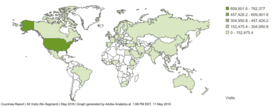
Other geographic limitations include the fact that a country level report is the only type of geo visualization available within Adobe. While Adobe can provide information site visits by state, designated market area and city, it doesn’t support visualization at this level of granularity.
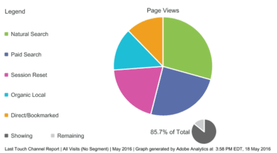
Charts representing proportions can also be problematic. Again we see the five bin issue; the pie chart (themselves subject to much hate) can only represent five dimensions at a time, even if there are more than five dimensions total.
Data Visualization
The gold standard in R visualization is ggplot2 (gg = grammer of graphics). The package includes a number of chart types and customization options to produce basic to complex time series, distribution, area and error charts. This is your go-to option for most charting functions, and there are a number of R packages that build on the functionality of this package itself.
Geographic Data Visualization
Since geographic visualizations are limited in Adobe, Choroplethr can help you build custom map visualizations to display geo data. One nice added feature of this package is the ability to pull in data from the American Community Survey API, which gives you an additional data source to add whenever necessary. A common analysis question when working with dealing with geographic data is to normalize the results based on the population of each area – which can be pulled from the API along with other major demographic variables such as income, demographics and other socioeconomic measures.
Color Selection
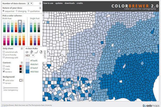
Any type of geographic visualization works well in tandem with ColorBrewer, a color selection tool. While the tool was created specific specific for cartography, it can help with color selection for charts in general. RColorBrewer is the package that replicates this functionality in R. ColorBrewer exists in both online and R format; if you want the same functionality in your browser head over to https://colorbrewer2.org.
Charting Online
If you’re looking for charts to produce for an online environment, the R packages from plot.ly are a good choice if a (paid) hosted environment is what you are looking for. Besides the Plot.ly package for R, they also support using the familiar ggplot2 R package mentioned above. This tool can produce really slick looking and interactive charts with hover, select and zoom functionality. (See also Shiny in this category of functionality).
Bring an XKCD Vibe
This one is mainly for fun, though it would be cool to use XKCD’s design stylings as your brand and dashboarding guidelines. The XKCD R package takes your ggplot2 graphs and gives them an XKCD style.
Pathing
If you’re looking to visualize pathing information using Adobe data, I’d direct you to Randy Zwitch’s posts on the subject where he nicely tackles that issue using both R and D3.
3. Put yourself out of a job.
Okay; I realise this probably isn’t your desired outcome. But what we’re thinking about here is how we can automate the generation of any of the data pulls, code, or visualizations you’ve created through scheduling your runs and even distributing your work for you. Essentially, you could be having a nap while R boots up, runs your code, updates your work and lets your coworkers know on an ongoing basis.
On a more serious note, if you have frequent reporting or dashboarding tasks that you’re looking to save time on, R can be a huge time saver in automating everything from the report pulls to the visualizations and even the final distribution.
Automation
taskscheduleR is an R package that schedules your R scripts to run automatically using Windows Task Manager. This provides you an option to run your scripts automatically if you don’t want to schedule automated tasks using either the command line or directly within Windows Task Manager. Features of the package including seeing what’s currently scheduled and adding and removing tasks.
Distribution
The R environment actually can also function as a way to send emails – so if you are looking to automate the sending of your Adobe reports and analysis, there is a way to do it. The mailR package uses Apache Commons Email to send emails and can send via authentical-based servers.
