It’s a brand new year, and a great time to make sure you’re completely up to speed on all that changed in Google Analytics in 2011. If you haven’t logged in to your Google Analytics account in a while, you’ll notice there’s a brand new interface. To get yourself oriented with what’s being called Google Analytics “v5,” check out our video tutorial! If you’re fairly comfortable with the new interface, read on for eight great new features to take advantage of in 2012. Today, we’re going to be taking a look at the first four new features. Come back tomorrow for the last four!
Cool New Feature #1: Multiple Dashboards!
You’ll probably recall that the Dashboard in the previous version of Google Analytics wasn’t very flexible. You couldn’t do much customization, and there was only one dashboard per profile. In Google Analytics v5, however, you can now create multiple dashboards, and you have a ton of options for how they look! Let’s take a look at a couple of examples of dashboards.
Social Media Dashboard
How about a dashboard that tracks all of the traffic coming in to your site from social media outlets like Facebook, Twitter, LinkedIn, and Google+? We can include any metrics we want on our dashboard, and can visualize them in many ways – all filtered so that only social media traffic is included. Here’s how it works. Each dashboard you create is based “widgets.” For any widget you create, you can decide how to visualize your data, which metrics you want to choose, how to segment and filter them, and more!
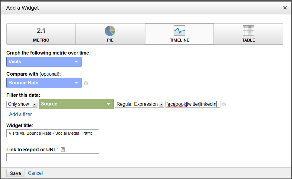
Here, we’ve chosen a timeline view that compared visits and pageviews, any time the source of the visit matches Facebook or Twitter or LinkedIn. Easy!
Mobile Dashboard
In this widget, we’ve chosen a pie chart that shows the percentage of visits coming from each mobile Operating System: notice how we’re only including data from iPhones, iPads, iPods, and Androids.
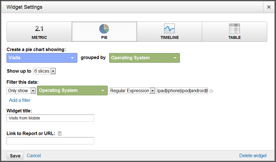
Custom dashboards are great because they help you get the data you specifically care about surfaced quickly and easily. Think about the reports you often use, and see if you can’t make a quick dashboard to replace it!
Cool New Feature #2: Google Analytics Real Time!
If you’re wondering whether Google Analytics really offers real-time data, believe it! OK, I’ll admit the data is delayed by between 3-4 seconds, on average, but that’s still pretty darn quick! There are a series of new Real Time reports, which you can find under the new “Home” tab in Google Analytics.
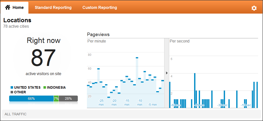
The Real Time reports will dance before your eyes, as visitors enter and leave your site. It’s easy to be mesmerized by the reports, and I have clients who have admitted to dedicating an entire monitor to Google Analytics Real Time. Unfortunately, that’s not the best way to use this feature.
Instead, utilize Real Time when you’re testing! Are you wondering whether or not a certain  page is being tracked properly? Are you concerned about a virtual pageview being set up correctly? All of your basic pageview data can be reviewed within seconds of the activity happening on your site. I’ve already saved hours using this feature to test implementation issues for Cardinal Path clients.
Cool New Feature #3: Goal Flow Visualization!
This might be my favorite new feature of 2011 (more on that later). The “classic” Google Analytics funnel visualization had some serious drawbacks. You couldn’t segment it at all, and you couldn’t change the way it worked and get funnel data retroactively. Well, gone are those dark days! With the new “Goal Flow,” you can do both of these things and enjoy a slick new interface to boot!
Here’s a simple example. First, let’s say I’m curious about how many reach the Cardinal Path blog after viewing the home page. That’s a very basic example of a funnel, and the Goal Flow will quickly help me understand how my funnel performs.
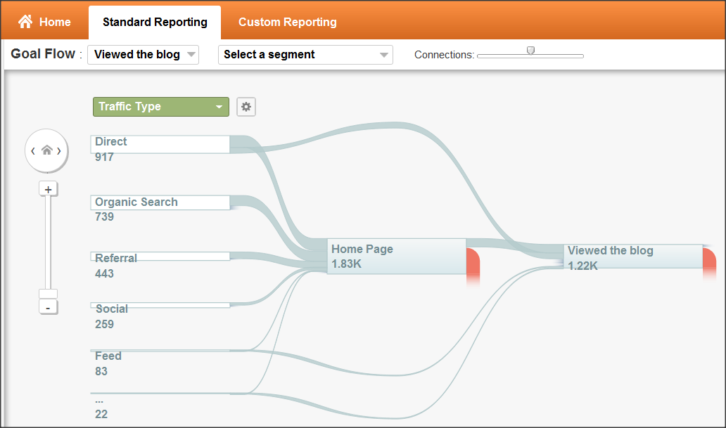
Here, I can see that the vast majority of people who reach the home page don’t end up viewing the blog. So maybe I want to see what happens if I change this funnel around. What if the goal was to see the “Our Work” page, and the blog was merely a step in the funnel, rather than a goal itself? Well, I can make that change in about 15 seconds, and the Goal Flow report will give me data retroactively!
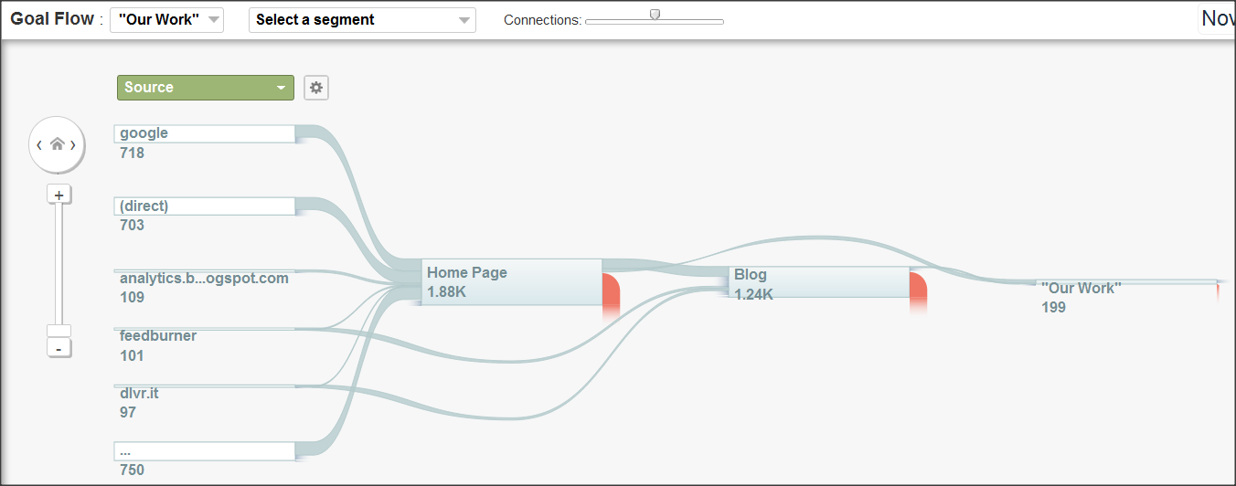
Now I see the blog as a step in the funnel, with the “Our Work” page as the actual goal. In this case, it turns out that more people are going straight from the Home Page to “Our Work” than are coming from the blog. Even more interesting, I can now segment this funnel to see how performance differs among various audience groups. For example, I wonder how this funnel would look if I only looked at New Visitors…
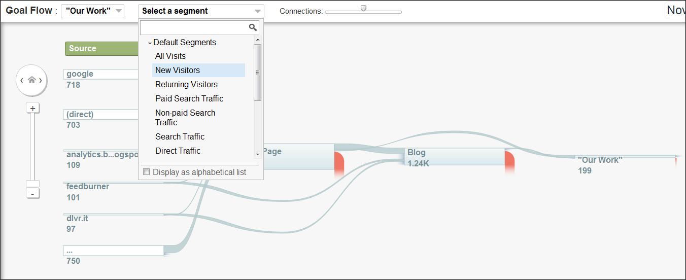
…and there it is! By using the “Select a Segment” drop-down box, I can now make this funnel show me data for any default or custom segment that is available in my Google Analytics profile. Pretty amazing stuff! If you want to learn more about how to use the Goal Flow report, check out this video from the official Google Analytics YouTube page.
Cool New Feature #4: Site Speed Reports!
We all inherently realize that our website’s performance from a load time perspective makes a big difference. If our pages take too long to load, our users may abandon our shopping cart, sign-up form, product page, etc. But what you may not realize is that your site’s speed is also increasingly a factor in things like your search engine rankings! Google Analytics will now automatically track your pages’ load times so that you can easily keep tabs on site performance.
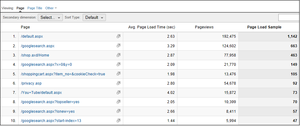
As you can see above, it’s now easy to see the average load time for any given page on the website. And you can get data that’s much more detailed than this! If you want to know exactly how much of your load time is made up of Redirection Time, Domain Lookup Time, Server Connection Time, Server Response Time, or Page Download Time, that’s all available too. Simply choose the “Technical” tab of the Site Speed report.
Well, that’s it for today. Don’t forget to come back tomorrow for 4 more cool new features that you can start using right away – without any coding required!


