A while back we had a post on email marketing and the importance of permission. As part of that we talked about how important it is to provide unsubscribe options for your receivers. However I have noticed that while many provide an unsubscribe option, frequently you must jump through hoops to actually unsubscribe.
It should be simple. You have a link in the bottom of your email which unsubscribes your user. ExactTarget uses a fantastic one click unsubscribe, but even if you’re using something other than ET the process should never be more than putting your email address and password into a web form, in fact only in rare cases should it be that complex—the end reader can always resubscribe if they leave accidentally.
So why then do so many companies make this so hard? Do they think that annoying potential customers is going to produce a greater likelihood of people reading their email?
Take a recent example of mine. A year back I went to Europe, and needed to catch a flight from Amsterdam to Bristol. The cheapest flight was with EasyJet, and I had heard good things about them, so I created an account and bought a ticket. It was a good flight, and I figured I would likely use EasyJet again.
I’ve been receiving email from them ever since.
I think I never unsubscribed because their emails were actually pretty good. They go out of their way to make their email marketing targeted, including letting you select which destinations you’re most interested in; what offers you like the most; and they give deals on flights and hotel. And deep down I still want to quit and go exploring the countryside of Greece, so such offers still appeal to me. In short they have a great campaign.
But I don’t see myself leaving too soon, and the frequency of emails from them was starting to annoy me, so I decided to unsubscribe.
First thing I noticed was how hard it was to find the unsubscribe link. Here, look at this tiny block of text (granted even smaller now thanks to the size limitations of our blog) and tell me which link unsubscribes.

Despite the fact that the sentences are topically unrelated, they have strung together safe sender verification, relevancy checks (you do think that they would put that on its own, since they want people to update them) and then after all of that, under an all caps “headline” of “Subscription information” there is a simple, non-descript “click here”. Why am I clicking here? Oh right, because if I have read this entire paragraph of unrelated mumbo jumbo I would know that this is how I unsubscribe.
But hey, now I am unsubscribed, right? Wrong. Now I am here:
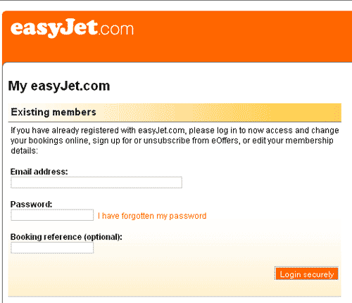
Ok, login. And password. What was my password? Let’s see, if I had credit information and was logging in on unsecured computers then I would have used my super secure log in. Nope. Secure log in? Nope. Ok, let’s retrieve the password.
My unsecure password. Doh.
But hey, I am in now and…
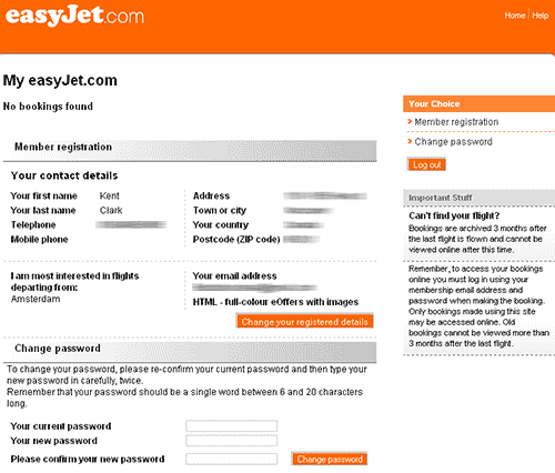
Huh? I thought that was supposed to unsubscribe me. Well, maybe this member registration link on the right will do the trick…
…and it does nothing. Looks like this page is actually member registration, though I find it odd that they would use mismatched target text and page titles. Also, why have a link to it if I am already there? Whatever. But I can change my registration details through the orange button—nice clear easy to see orange button. Maybe unsubscribe is there?
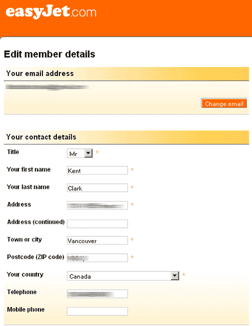
Doesn’t look like it. This looks like a space to update my contact details. But maybe under “change email”?
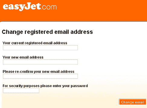
Nope.
Oh wait, if you scroll well below the fold on the member details page you get…
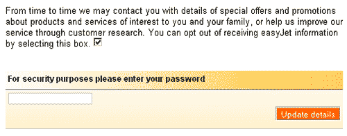
…a block of text that sounds like it is trying to sell you on signing up for their newsletter. Well, I wouldn’t want to click that non-descript check box, because having read most of the paragraph of obviously promotional text I know that checking that would likely be agreeing to opt-in for… no wait, “you can opt out by…”
And then I have to enter my password. Again.
Conclusion
So here we have it. To unsubscribe you have to dig through your user preferences and check a box that does not say unsubscribe, but rather follows a large paragraph of asking you to “opt out”.
So the lessons to be learned from this?
- Don’t hide your unsubscribe – use link text like “unsubscribe”, make it unsubscribe you
- Label your check boxes and links properly, not with long paragraphs.
- If you don’t want to make the unsubscribe link unsubscribe you, at least make it take you to a page with an obvious unsubscribe option.
- Don’t hide your links or checkboxes in large blocks of text – someone who wants to unsubscribe doesn’t want to read two different paragraphs of 6pt text
- Stop asking me for my password!
Or maybe, you know, you really want to make it as hard as possible to unsubscribe. In that case, do all those things. They’re great ways to make sure people don’t leave your mailing list. But if you decide to do that, just one thing:
Never ever send me another email ever again.
April 24th Update: And despite unchecking that box, AND changing the email I have registered with them to an account I never check, I am STILL getting email from them. Congrats Easyjet, you’ve managed to make unsubscribing impossible.


