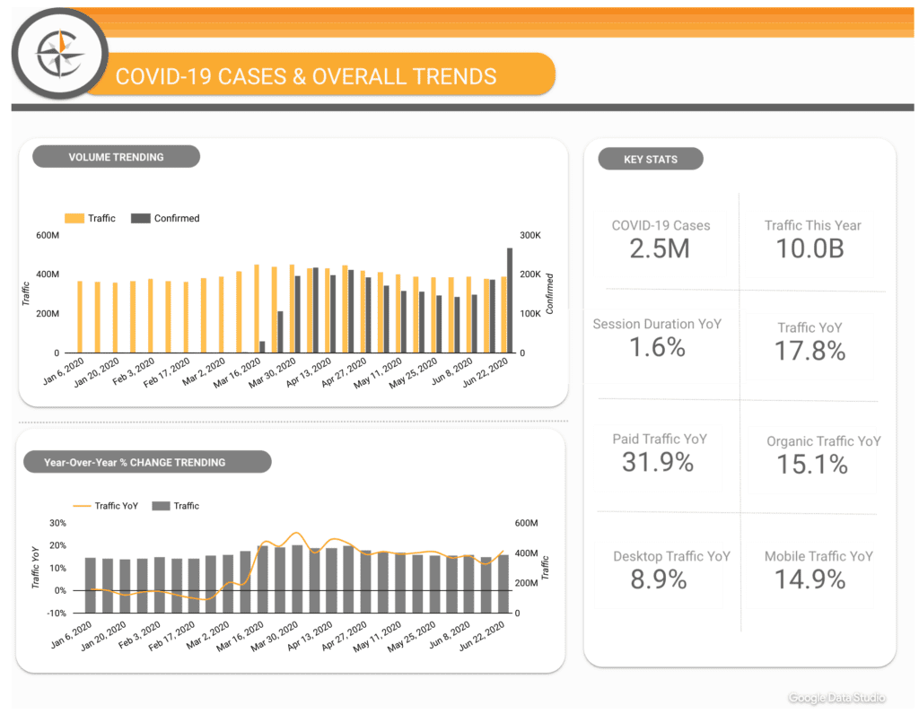
If you’re looking to upgrade your business analytics tool but feel uneasy about learning a complicated new data platform, Power BI by Microsoft may be just the thing for you.
What I like about Power BI:
- Easy-to-use reporting tool that allows you to perform analytics functions and create insightful reports
- Good performance with accurate measures
- Faster than Excel
- More capacity to view vast amounts of data
- Ability to compress large files of data and only use 50 Mb while doing it
- Ability to upload data from a variety of sources to visualize data trends, create themes, metrics and dimensions, edit queries and upload to the cloud
- Uploading to the cloud creates an easy sharing of dashboards
In this article, I’ll show you how to import data, conduct queries and edits, and create visualizations.
Importing Data
Importing your data is as simple as clicking “Get Data” and selecting your source. You have the option to import data from Excel, Txt/CSV, Odata, the web, and a few others.
Want to pull data from the internet? It’s not as complicated as you might think. Select “Other” and then the “Web” option. After you select “Get Data” and “Web”, copy and paste the website link into the window that will appear.
From there you will have the option to load or edit the data. Editing the data is always the easiest and recommended option.
Queries
Editing queries means you can filter through your data and delete any columns you may not need or fix any import errors. To delete columns, select which columns you would like to remove and hit the “Remove Columns” tab.
You may edit your numbers if you want to convert your them into currency, decimals or date. Do this under “Edit Queries.”
When you finish editing your data, close and apply these changes to your dashboard.
With your data prepared, you can now begin creating relationships, DAX formulas, and visualizations.
DAX Formulas
DAX Formulas are similar to excel formulas. You can multiply, divide and calculate from within your columns. Simply right-click on one of the column names under your fields tab and select “new measure”. In the toolbar that will appear you can name and create formulas that you desire. A calculator icon will appear in the fields toolbar where your measure has been created. If you are not familiar with DAX I highly recommend taking an online course on DAX language to familiarize yourself!
After you create your formulas you can click and drag these measures into your dashboard. There are a variety of dashboards ranging from bar charts, line charts, slicers, hierarchy slicers, tables, calendars, maps and many more. This enables you to create any kind of visualization that meets your needs.
Visualizations
Click and drag data fields into your metrics and dimensions tabs by values under the visualizations. Here you can mix and match measures to formulate your visualizations. Take it two steps further and add drill-downs and filters to your data after you select your metrics and dimensions. See the example of creating a table below:
PowerBI gives you the capabilities to present up-to-date and easy-to-read dashboards that you can personalize for any client or stakeholder. It’s a fast and effective tool that will save you some serious headaches and efficiently manage your data in the process.


