Since I coded my first WAP site in 2000, every year has been the one where the mobile market is going to explode. Jokes aside, it is true that currently the mobile handsets market is growing faster and stronger and it is time to take it a bit more seriously.
For example, in countries like Brazil if the number of mobile users keeps on growing as rapidly as it has across the last few years it will outrank desktop users in first months of 2014 (according to comScore). Wow!
Detecting mobile devices, tablets and other oddities
Serving the right content for mobile devices is more than a headache. As tablets have become more popular it has become a full blown migraine. It’s not only content, but usability for small screens has to be ensured… although having a clear idea of what “small screen” means can be pretty hard.
Take a look at a report in your analytics tool showing mobile operating systems + screen resolutions and the nightmare begins. Just a small sample:
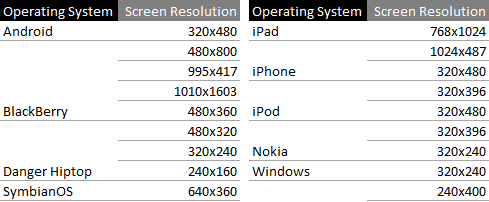
Before there was such a large list of devices, detecting the User-Agent and comparing it to a list was enough to know the technical details of your visitors. This doesnt work so well any more.
A better way to do it could be to parse the User-Agent looking for words like “mobile”, examples:
Mozilla/5.0 (Linux; U; Android 2.1-update1; en-es; HTC Hero Build/ERE27) AppleWebKit/530.17(KHTML, like Gecko) Version/4.0 mobile Safari/530.17
User-Agent: Mozilla/5.0 (iPhone; U; CPU iPhone OS 3_1_2 like Mac OS X;
en-us) AppleWebKit/528.18 (KHTML, like Gecko) Version/4.0 mobile/7D11
Safari/528.16
Mozilla/5.0 (iPad; U; CPU OS 4_3_3 like Mac OS X; es-es) AppleWebKit/533.17.9
(KHTML, like Gecko) Version/5.0.2 mobile/8J2 Safari/6533.18.5
Some others, like Blackberry or Nokia, don’t include the word “mobile” so you have to be more brand-specific:
BlackBerry8220/4.6.0.174 Profile/MIDP-2.0 Configuration/CLDC-1.1 VendorID/107
Mozilla/5.0 (SymbianOS/9.3; U; Series60/3.2 NokiaN79-1/32.001; Profile/MIDP-2.1 Configuration/CLDC-1.1) AppleWebKit/413 (KHTML, like Gecko) Safari/413
This isn’t super easy but it works much better. You can find pretty good ready-to-use scripts at https://detectmobilebrowsers.mobi or you can analyze their logic and code your own.
An additional question may be what you should consider a mobile device, and how they should be viewing your site. For instance, tablets can fall into the mobile bucket but they probably deserve the whole experience not the reduced version for small screen mobile devices.
Screen resolution adds another variable to equation, if you want to go this far. The issue is no server side scripting language can guess the screen resolution of the device so you need a combination of JavaScript and something like PHP. Here you have an example of both working together: https://www.daniweb.com/web-development/javascript-dhtml-ajax/code/216654
Test, find out and decide, no other way.
What Instant previews has got to do with mobiles?
Search engines have different bots for regular web sites and mobile versions of them, examples of Google user-agents:
Web
Mozilla/5.0 (compatible; Googlebot/2.1; +https://www.google.com/bot.html)
Mobile
SAMSUNG-SGH-E250/1.0 Profile/MIDP-2.0 Configuration/CLDC-1.1 UP.Browser/6.2.3.3.c.1.101 (GUI) MMP/2.0 (compatible; Googlebot-mobile/2.1; +https://www.google.com/bot.html)
DoCoMo/2.0 N905i(c100;TB;W24H16) (compatible; Googlebot-mobile/2.1; +https://www.google.com/bot.html)
Always, no exception, avoid showing different content to search engines than to users, (that’s cloaking and will get you penalized) but detecting mobile user-agents to send mobile visitors to the right versions, including mobile bots, shouldn’t be a problem.
The danger is when bots end up trapped due to a poorly crafted solution for the problem of serving content correctly to different devices. “Fetch as Googlebot” at Google Webmaster Tools helps you check if you are doing it right and troubleshoot in case not fetching pages at your site using mobile crawlers.
The opposite is also a problem; search engine web bots can get redirected to your mobile version. This is where Instant Preview comes to play. Have you checked the instant previews of your site? Use the site:mysite.com command at Google and click on the magnifying glass at the right hand side of links in SERPs to see the preview.
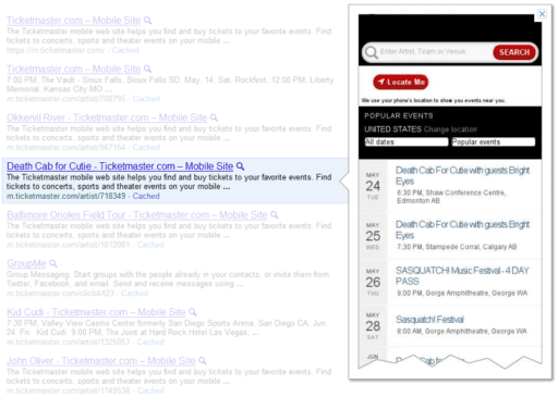
Everything looks good and consistent? Are the previews of your site’s mobile version showing the mobile pages? Previews of your regular web site showing it correctly? No? Something is clearly messed up. Halt any other SEO or technical task and fix the problem, as indexation issues are crucial to solve. These types of errors are not very frequent but I’ve seen them.
A few days ago Google added a function to Troubleshoot Instant Previews in Webmaster Tools but to be honest it is pretty useless in its current state. Yes, it is under Labs section but
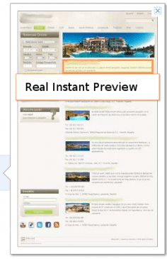
- The previews you fetch there don’t match the ones you see art SERPs, last ones are the real ones so the first are not helping in any way.
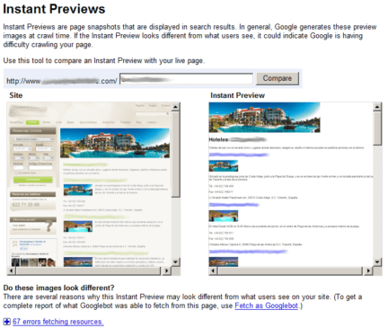
This is the actual preview for this page. You can see there is a big difference.
- see the below image and that the “Roboted” or “Fetch Failure” have no description or further information to fix them.

In summary, maybe it will be useful in a near feature but right now it is a very immature tool and it does not help detect and solve these problems.
I want a mobile version of my site, where to start?
I have not coded an entire site for mobile devices in ages and becoming an expert in this field is not in not anywhere in my future plans, so I’m not the right one to give advice but I found this presentation very insightful, take a look: “Rethinking the mobile web”


