In this post, originally published by Marketing Land, Dave Booth, the 2014 Digital Analytics Association’s Practitioner of the Year, explains that it’s not just about collecting data. You need to know how to activate that data to extract value from it.
The digital age is well upon us. But as marketers, if we step back just a bit and examine these exciting times we’re living in, we also have to recognize that this new era of data and analytics represents what is still a very nascent industry.
And if you’re like most organizations, that means that while you might be collecting more data than ever before, odds are good that the challenge lies in activating that data to derive some measurable impact or value from it.
I’ve written before about the three layers of data and analytics success. Let’s take a look at some very real, very tangible things we can do with data along a very straightforward path that many practitioners are finding tremendously valuable.
It’s pretty simple:
- First, use data to tell us what happened in the past and see what we can learn from things that have worked and those that have not.
- Then, we can use data to tell us what’s happening now and what we can do to optimize the digital experiences of the present.
- And finally, we can use all of these new data and analytics tools, technologies and methodologies to help us predict what will happen tomorrow and beyond.
Learn From The Past
This might be the most straightforward and comfortable of the stages, because you’ve probably been doing it for many years. Think of that report that lands on your desk every Monday morning with the sales/marketing/operations/financial/whatever-you-care-about numbers that detail all that has occurred in the past reporting period.
We’ve all gained wonderful understanding and insights from reports like these, and they can certainly help us make better decisions. But we also need to be careful to not get stuck in the “reporting rut.”
New data we’ve never been able to collect before, new tools and technologies that allow us to organize and query massive repositories like never before, and ever-expanding computing power to run and automate ever more complex tasks (closer and closer to true real time) can provide immediate value in either enhancing your tried-and-true reports or giving them an intensive makeover.
Make Interesting Things Jump Out With Data Visualizations
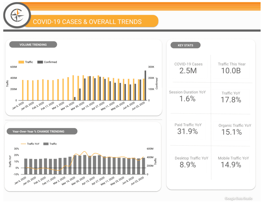
In just the past few years, there has been a surge of activity in the data visualization space, with a slew of new tools dedicated to helping people visually make sense of the data they need without being overwhelmed by the sheer volumes of it.
We’ve all sighed in silent defeat when asked to make sense of that Excel file containing a table of 25 columns and 150,000 rows of raw data, and often the first thing we do is start looking at our charting options.
The good news is that these days, we’re well past the simple bar-and-line-graph reports of days gone by. And don’t get me wrong — these and other traditional data visualization staples can still be a highly effective means of understanding large sets of data.
But some of the more modern visualizations can take this data and make it very easy to see areas of interest pop right out at you.
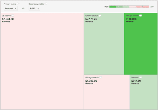
Let’s say those 150,000 rows represented keywords you’re bidding on in a complex search engine marketing strategy. Being able to quickly group that data at levels like a campaign and visualize all of it in a treemap like the one below can quickly show you a) where your revenue is coming from (biggest boxes), and b) where your highest margins are (greenest boxes).
There are many, many data visualizations that span the simple to the complex, and the key is to find the visualization that tells the story you’re interested in.
Explore And Mine The Data Beyond The Report’s Required Fields
And don’t settle for your weekly or monthly static reports. The data visualization tools of today are meant to encourage exploration, and the underlying technology and computing power make this possible.
So click on things, drag them around and see what you find. Join different data sets in near real time, filter it down and look at the data with as many visualizations as you can stand.
Take the treemap above, for example. A visualization like that is just begging you to click on those boxes, and when you do, you’ll dive down into deeper levels of granularity to understand the data at an even more detailed level.
A couple of clicks into one of those big, red boxes, and you’ll be uncovering exactly which keyword bids you should be pausing and which you should be expanding. And changing your primary and secondary metrics could tell you a lot more about what your campaigns and individual bids are getting you with respect to user engagement, revenue, or other desirable actions you’re tracking.
Put The Data In Context To Give It Meaning
Remember that whenever you’re looking at data from the past, you need context to give meaning to your numbers. For example, if I told you that you had $10,000 in sales, what does that mean to you?
The first question you’d ask me is one that starts to add context: In what time period? Good question. So let’s say the second week of April.
The next thing you’ll logically and automatically do in order to understand if that’s a good or bad number is to compare it to other weeks — again, to provide context. If in the previous week you sold $200,000, then you might be inclined to say this is a terrible number, but if the previous week posted $10 in sales, you might say that’s a great number.
All very basic, and of course you’ve probably always been putting your numbers in the context of a comparison with the past. Week over week, month over month, year over year … but this is just a start.
Sticking with time-based context for sales numbers, things like seasonality, can have a massive impact on many industries.
So what if, in that previous week we looked at, you did indeed sell $200,000 … worth of Easter eggs. Now, the fact that you still managed to sell $10,000 the week after Easter might be really good. But to see for sure, you’re probably going to want to explore the same post-Easter week in years past for even more context.
And it goes beyond time. Macroeconomic conditions, internal business decisions and strategies, market shifts, even the weather can impact your numbers.
A healthy curiosity for why the numbers are the way they are can help you understand and learn even more from your data.
Make The Data Tell A Story With A Clear Recommended Action
Ultimately, the purpose of examining the past is to make better decisions for the future. And the reality is that this is almost never as simple as it might seem. Corporate structures, lack of governance, and inefficient communication mechanisms can be issues that are every bit as strong as organizational politics.
But storytelling with data is one thing that’s very effective in capturing attention and becoming a catalyst for action. And because of this, many of today’s industry-leading data visualization and reporting tools are baking presentation and storytelling tools right into their platforms.
Going back to that 150,000 row Excel file example, the decision makers you’ll need to influence simply won’t have the time or the appetite to go through your current or old reporting mechanisms.
Starting out with something as simple as a PowerPoint presentation that tells the story of what’s happening, and then both presents and supports a recommended course of action with exactly the right data represented by relevant visualizations, can be an effective way to ensure your data discoveries are actually driving decisions and enabling positive change in the organization.
Experiment In The Present
The second step is to move beyond the past and examine the present. And while looking at and working with historical data are where many of us are very comfortable operating, the “real time” nature of digital has opened up a number of new ways to use data in the now.
Multivariate And A/B Testing
If you have any significant investment in digital and you’re not testing at this point, then I won’t kick you while you’re down here (because you already know you need to be doing this and are probably drowning in shame!).
Testing can be done across just about any digital channel or asset you have, and it can provide incredible insights about how your prospects and your customers are engaging with you and the digital experiences you’re providing them.
Take simple website or even mobile application testing strategies. You’ve invested (and continue to invest) in architecting, designing and building out what you thought would be the best possible thing with the coolest features you could give your audience. But let’s face it: You don’t have any idea how they’ll react until you give it to them.
Sure, you can do focus groups and learn some valuable things. But in the digital age, you have the ability to test with your entire audience (or a controllable portion of it) right now and see exactly what they think.
There’s no doubt that your designers and management have argued over competing ideas during the creation and launch of some page, feature or idea, and testing can be an incredibly effective way to declare a winner.
But best of all, establishing a culture of testing, backed up by a solid testing strategy within an organization, means that you’ll be on a path of continual optimization and measurable improvements.
Personalization
And while you’re serving up content or even ads, you can use data to personalize the experience.
Maybe someone is logged into a website or an app that you control. In this case, there’s a lot you can do to personalize their experience, making content and their interaction with you more relevant, and as a result, more likely to have a positive outcome.
For example, we’ve had clients that have leveraged the demographic information their users give them to dynamically change imagery and messaging based on “who” a person is. If you’re in your 30s and married with small children, you might see a different set of products and services, prioritized with images and photos featuring young families.
But even if you’re not logged in and haven’t shared any personal data, your anonymous attributes and behaviors can trigger personalization opportunities. Cookies that remember what you’ve looked at or purchased on an e-commerce site, for example, can drive recommendation engines and promotions. Bought shoes last week? Great! Take a look at our specials on socks.
Knowing that you arrived at the site from a certain ad or promotion, that you’ve been to the site before, or even that you use a certain technology (remember when the Wall Street Journal found Orbitz prioritizing higher-priced results for Mac users?) can all help to personalize the experience.
And even really anonymous attributes can be used here. Take, for example, geographic location that can be quickly identified from an IP address and weather information for that geography. With these two pieces of information and a handful of rules, you can be offering specials on “hot cocoa” to your northern Minnesota visitors while offering “iced flat white” coupons to your Sydney customers enjoying the summertime heat.
Media Targeting
Personalization, of course, also extends into the media space these days.
Retargeting campaigns have become immensely popular and can programmatically sign up prospective recipients of your advertising based on the data that tells us the things they do. The most obvious examples you’ve likely seen: Leave something in your shopping cart without purchasing it and be hounded by banner ads for that same product for the rest of your natural life.
But there are many other creative ways to use your data to create retargeting lists based on the actions people are taking right now.
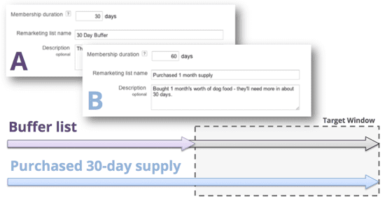
Let’s say that you sell a 30-day supply of pet food on your website, and someone has just reached the thank you page indicating they’ve just bought it. You can immediately sign them up for two remarketing lists: a “buffer” list that does nothing more than lasts for 30 days, and a second one that’s for people who have purchased a 30-day supply, this list expiring in 60 days.
Now, you create a retargeting campaign that requires two criteria to be met: recipients of my pet food refill campaign must a) be active on the purchased a 30-day supply list, and b) not active on the “buffer” list. This has the desired effect of targeting people with special offers on refills right when they’re about to run out.
And this is just one example of some of the creative uses of data to drive current advertising.
Take, for example, the data being collected about audiences across the Web every second of every day. Ad platforms and data management platforms (DMPs) collect all kinds of data and then offer it up to advertisers who would like to target those attributes and behaviors with their advertising. Real-time bidding (RTB) platforms can enable programmatic ad buying, taking into account all of these targets that include a constantly changing audience.
Predict The Future
Last, but certainly not least, is using data to predict the future.
It’s important to recognize that this is nothing new, and data scientists have been using data to model many of the same things we do today for many, many years. The only difference these days is that we now have access to a lot more data; we have access to it a lot faster than ever before; and we have unprecedented computing power to apply to it.
But the fundamental goal of predictive analytics has remained the same: Use our data to tell us where our strategy should take us going forward.
There are, of course, lots of applications of this, but here are just a couple that can hopefully get your creative juices flowing and lead to your next project or analysis.
Lifetime Value And Churn Modeling
It’s, of course, no secret that not all customers are created equally, and some are more valuable than others. And not surprisingly, consumers who don’t stay customers tend to be worth less to an organization.
Companies have been working to understand the long-term value of their customers and how to keep them for a long time — and in the digital age, we have access to more attributes and behaviors than ever before.
At the end of the day, initiatives like these are trying to answer some very fundamental questions:
- Who are my best (and worst) customers?
- What are the behaviors and attributes that these groups share?
- Can I use data to predict the value of a customer I’m currently acquiring?
This kind of analysis can turn up some very interesting results. For example, we did some lifetime value work for an educational institution, and we were able to see a lot of what you might expect: Young men pursuing their first degree with undeclared majors are much more likely to drop out (churn) and therefore be worth less as lifetime customers. Not surprising.
But one of the attributes we looked at was how far away students lived from campus, and while you might think that those living closer to campus would be less likely to drop out, the data told a different story. The closer students lived to campus, the more likely they would be to leave their degree program unfinished.
Why? In this case, it comes down to attribution and media mix modeling.
Attribution And Media Mix Modeling
Understanding how all your marketing efforts are impacting the customer journey in today’s world is a challenge, in large part because the path to purchase is no longer linear. The reality is that we as consumers are exposed to multiple marketing messages through multiple channels across multiple devices across different stages of the marketing funnel.
Organizations have many touchpoints with their customers through many mediums, and understanding the values of each of those efforts quickly becomes extremely complex.
Following this educational institution example, let’s keep things simple by sticking with only digital channels and say that a prospective student was exposed to an upper funnel display campaign touting the benefits of getting a degree.
The prospect does nothing with that for a week, but eventually becomes curious and does a search on the educational institution’s name, clicking on a paid search ad to visit the site. They browse around, and eventually sign up for an email newsletter. A week later, an email is sent to them, and the prospect clicks on a link and fills out the pre-application form that’s used to count a lead conversion.
Now here’s the immediate question: Which channel should get the “credit” for that conversion?
The original display ad that planted the seed? You could certainly argue that. Or maybe the search ad that led to the email newsletter signup. But if it wasn’t for that email campaign, they never would have filled out the form?
The answer is that they probably all should get some credit, and many different models can be built to assign values.
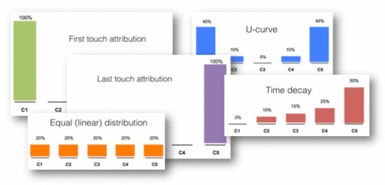
But once you’ve started to get a handle on the attribution model that works for your media mix, the bigger question is this: Knowing the value of each of my marketing channels, what’s the best way to allocate my marketing budget?
This is nothing more than media mix modeling, and again, while today’s tools and technologies make this more accurate, faster and more robust, it’s not a new concept.
Now, let’s go back to why students living closer to campus were more likely to drop out.
Combining an understanding of your media mix with customer lifetime value can really drive some big value. In this case, when the organization needed more leads, it would simply canvas a geographic area near the campus with marketing channels that were intended to get people to fill out that lead form quickly without much of a risk and without the commitment of picking up and moving to begin a new academic pursuit.
While those marketing channels tended to show very high conversion rates, they were converting exactly the wrong kind of student: those young men who didn’t know what they wanted to study yet!
When you understand which channels are attracting the right audiences, you can then use your data to build models that can predict what is highly probable to happen if you took a little budget from here and added it to there, and this can help drive some extremely valuable decisions.
Turning Data Into Dollars
In the end, there are myriad ways to extract value from your data, but simply collecting it isn’t one of them.
Knowing where you’ve been, being able to learn from what you’re doing now, and using all of this to see where you’re going and steer your strategy accordingly requires that you activate that data — and that’s where you’ll start turning it into true, measurable value.

