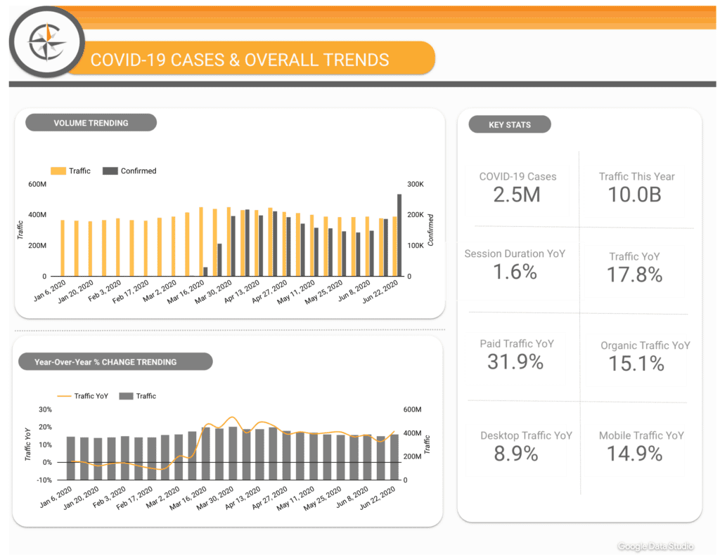
Insights are grand, and being able to take quick action with them is better. But at some point every analyst needs to make reports.
Sure you can cut and paste graphs out of Google Analytics or Site Catalyst, but when you’re handing out reports to big clients some times it helps to have something a little more “your own”. More importantly, by customizing the presentation of data you can make much of this information easier for laymen to understand.
Today I’m going to walk you through a few easy ways you can add your own colors to your reports using Adobe Illustrator.
Part 1: The stack graph
Let’s start with something easy. How many visitors did you get from your each medium? Let’s take a look.

I’ve created a quick custom report here, just listing medium with each clickable to expose their source. Somewhat useful data for some initial investigation into site performance, but a god awful report. You can combine these together using custom segments, but that creates limitations too, so I recommend just clicking each and exporting the data. Yeah, its a pain, I know.
Just paste it all together in a spreadsheet. While doing this I would convert the data to a more readable format, like a mm/dd/yy format.
I recommend you put overview at the furthest right in your data as it will make it easier to remove for stuff like stacked graphs
Now select your data, with titles, copy and into Illustrator we go.
For this we’re going to create a stack graph. The nice thing about this is that stack graphs really illustrate what areas of your traffic are causing spikes in traffic.

Select the graph tool, pictured above, and drag a box on the display area. This should give you a spreadsheet box which you can paste your data into.
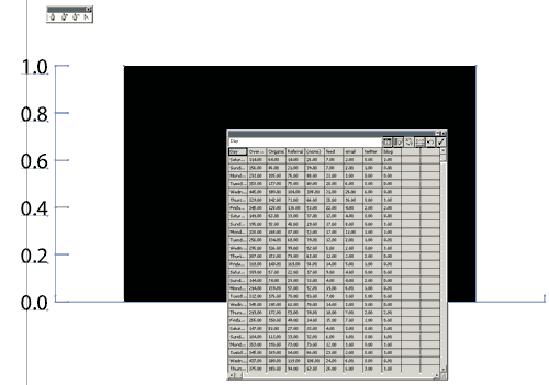
Note: You will need to remove any commas

Oooh that’s a mess isn’t it? Let’s clean it up. First we’ll reduce the font size by selecting the graph and going to window>type>character. That doesn’t help with the mess of numbers at the bottom. There are lots of ways you can deal with this, I chose to rotate them all 90 deg.
Now lets make it a more useful graph. Right click with the black arrow tool and select type, then choose area graph. Now you’ve got some data laid out, use the white arrow tool to select all of your graph objects and remove the stroke on them by selecting them, clicking on the outline box in the toolbar, and selecting white with a red line through it from the color window (window>color).
Now toss a few effects. A drop shadow (effect>stylize>drop shadow) with settings dependent on your document (fiddle until it looks right). Take away the needless lines, and clean it up a bit and voila!

Of course if you want to get really fancy you can go 3D, though with a stack graph this communicates your data wrong.

You can see that in this situation it displays each unit as a separate data set, implying that Twitter, for instance, sent more traffic than organic, something that is not true.
Part 2: The Line Graph
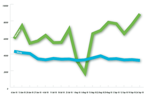
This time lets do a line graph. Find a report you like in GA, say a comparison of revenue and visits for non-paid search traffic, and export your data. Again, remember: no commas.
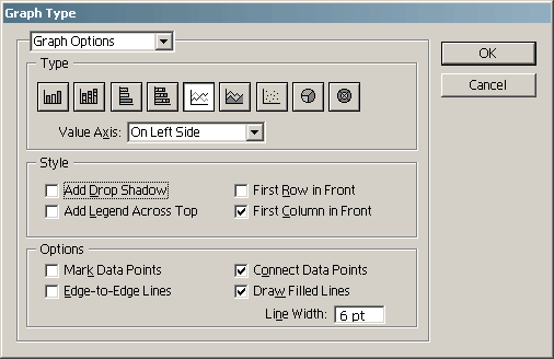
Under graph options you can set the thickness of your line. To set this you will need to check both ‘connect data points’ and ‘draw filled lines’.
Now select some colors, some decoration (I know, I’m going overboard with the drop shadow today. That’s what happens when you set up graphic styles), rearrange your reference data (and hide what you don’t want by setting its colour to invisible) and you’ve got something more presentable.
Part 3: The Pie Chart
I’m going to be honest: I hate pie charts. I don’t think that they serve the purpose of showing particularly meaningful or relevant information and I rarely look at them. However, they do look good on presentations and reports, so here is a quick pie chart:
Take your data, in this case just an export of ‘traffic sources overview’, and export. Take your columns of data, and drop them in as usual, this time selecting the “pie chart” tool.

Colour your chart with some nice colours, here a selection of green blue and orange, and you have a presentable chart. If you’re looking for something with more depth, apply a 3D transform.
You will have to rearrange each piece of the chart so that it connects in “3D space” as 3D transform will transform each piece of the chart individually, leaving them in their innate positions, and making the chart look broken. You can re-arrange each with the white arrow tool.
In the end it’ll look something like this:

There you have it. Three different types of charts, illustrating how you can use illustrator to touch up your charts and improve your reports. Play around with your designs a bit, and talk to your marketing/design/whatever department about what kind of design elements/colors you should be using.
For more on creating graphs with Adobe Illustrator see:
- How to Make a Graph in Adobe Illustrator
- Create Beautiful 3D Graphs and Charts in Illustrator
- 3D Charts in Adobe Illustrator CS
- Creating Graphs with Adobe Illustrator


