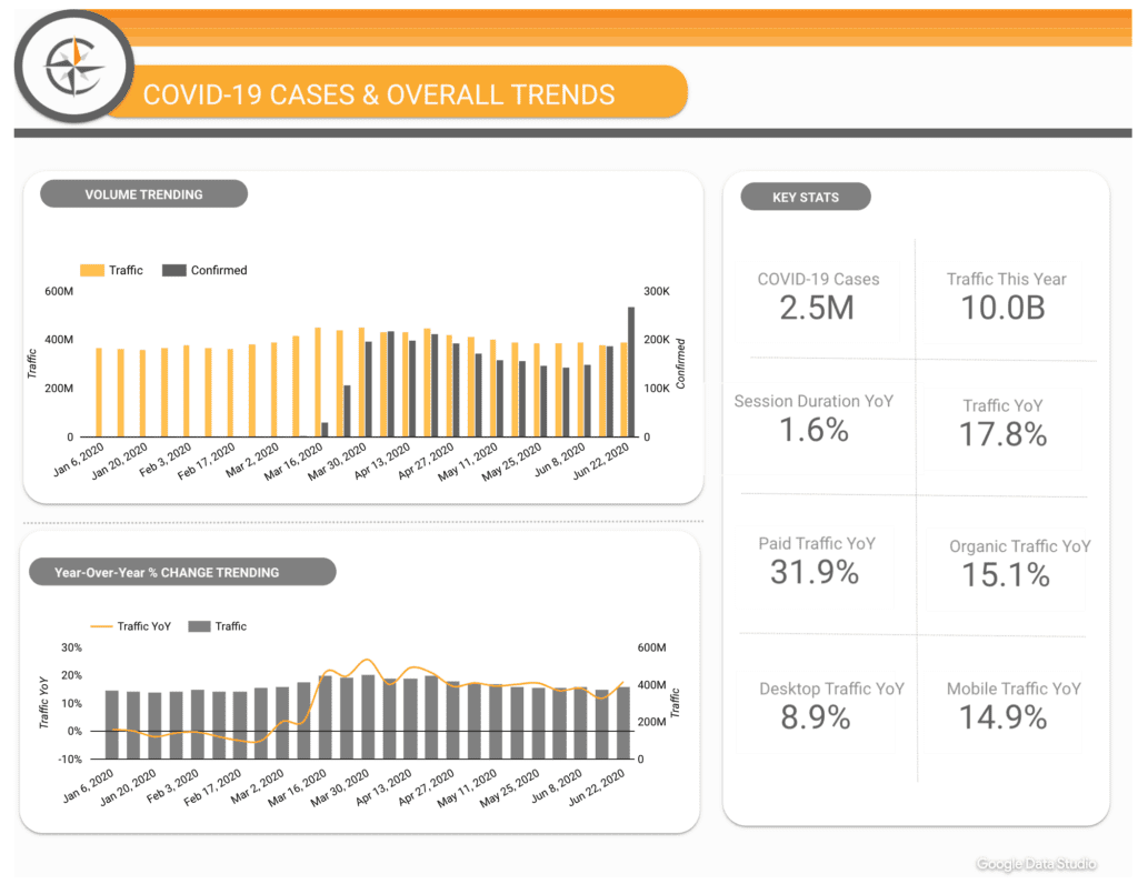
One of the advantages of building a dashboard in Adobe Analytics Workspace is how easy it is to share. Whether through a live link or as a scheduled PDF, you can ensure that stakeholders can easily view your data visualizations. But if you’re looking to make a real impact on the business with your data-driven dashboards, they’re going to need to look sharp. Read on for some practical ways to apply both visual appeal and next-level usability.
Add a Splash of Color
Adobe Analytics Workspace allows you the option to choose a particular color palette for your dashboard. You can choose from one of five built-in color palettes, or you can build a custom palette of your own. The latter option is particularly useful for those who want the colors of their dashboard to match company branding.
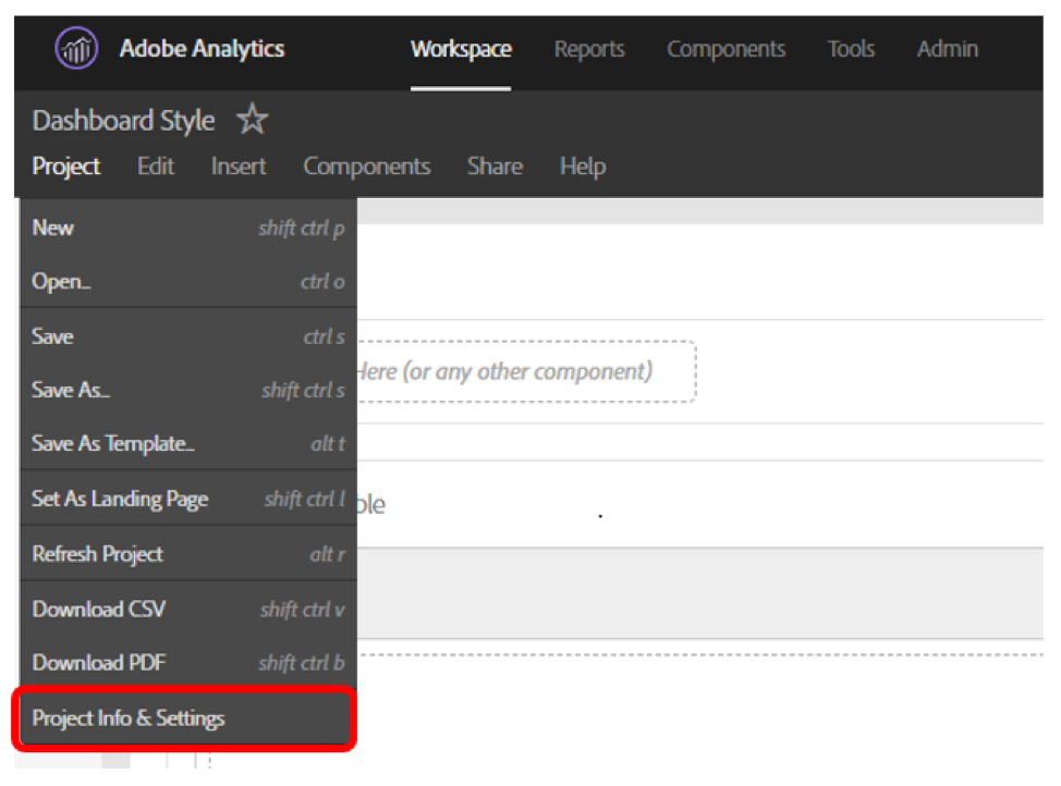
To access the color palette, click to ‘Project’ in the Workspace menu and then to ‘Project Info and Settings’.
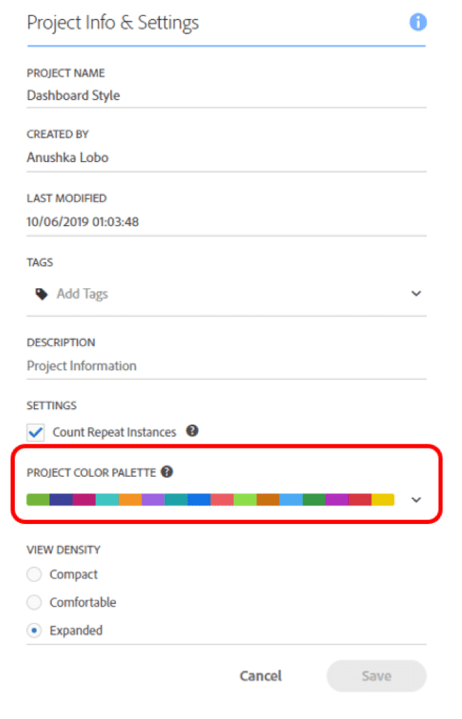
Within the popup, you will see a row for ‘Project Color Palette’.
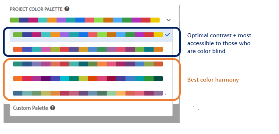
The drop-down carrot will display the five pre-built color palettes The first two options are optimized to show the highest contrast and designed to be more accessible to those who are color-blind. The last three options are combinations designed for color harmony.
If you click ‘Custom Palette’ you will see the option to insert hex values to create your own color palette. The custom palette option allows for a minimum of 2 and a maximum of 16 colors in the palette.


By judiciously choosing the right pre-built palette, or designing one of your own, you can use the colors of your visualizations to add to your dashboard’s beauty.
Editing Labels
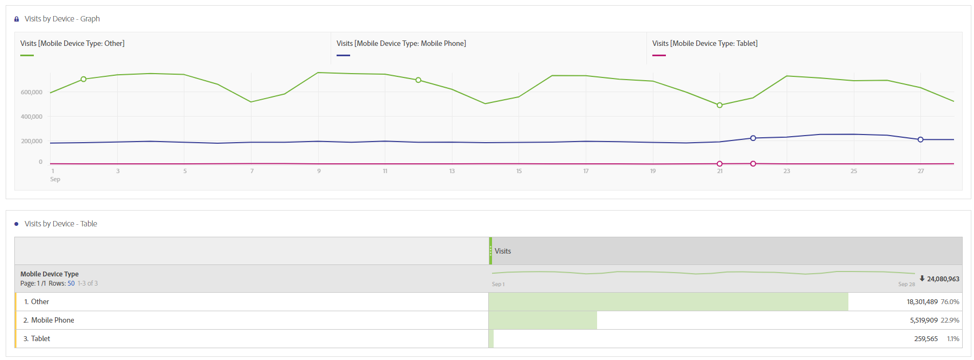
When you create a graph in Adobe Analytics Workspace, the automatic data labels tend to be a bit wordy. You may want to rename them to something simpler to read. To do so, you can use the ‘edit label’ function.
In the example below, we want to simplify the labels so that references to Visit and Mobile Device Type are removed. We also want to change the Mobile Device Type of ‘Other’ and call it ‘Desktop’ instead.
In order to rename the data label, right-click on the data label and then click ‘Edit Label’
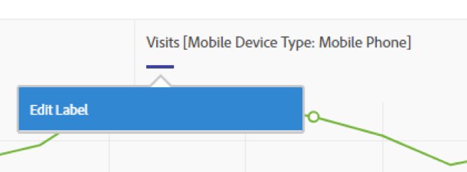
Type in the altered label and press Enter to save the new label for this graph.

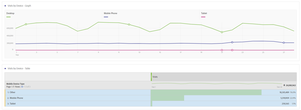
In this way, you can have cleaner labels for your graphs. Note that for this example, while we remove the references to ‘Visits’ and ‘Mobile Device Type’ in the data labels, we still include them in the graph title. This ensures that even with the modified labels, viewers are still fully aware of what the graph is depicting.
Bucketing dimensions
Sometimes, it is easier to get the message of your visualization across by bucketing certain categories. For instance, while Adobe separates traffic via Mobile Phone and traffic via Tablet, it may make sense for you to bucket the two into one category. In circumstances like these, you may want to use segments to create your own buckets.

Ordering dimensions
Usually, the dimensions in a table (and therefore the dimensions in a graph) tend to be ordered from highest to lowest metric.

However, sometimes there might be instances where you want dimensions to follow a specific order. Say, for instance, you want Paid Social to always appear before Organic Social
First click to the dimension

And then drag and drop the elements you want, in the order you want, into a table.


You also have the option to order things alphabetically.
In order to do this, highlight the elements you want to alphabetize, right-click and choose ‘Display only selected rows.’
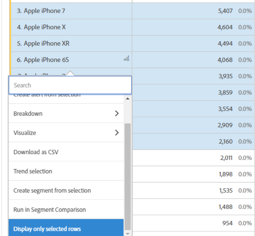
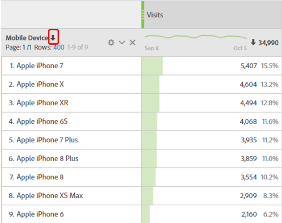
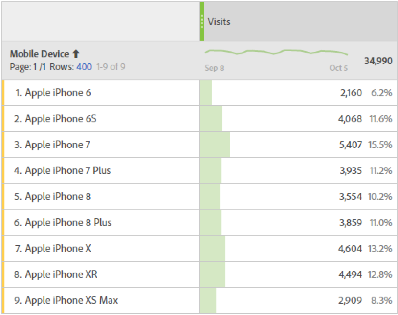
Utilize the arrow by the Dimension name to alphabetize from A-Z or from Z-A.
You will find the dimensions of the table are listed in alphabetical order.
Explanatory text boxes
Adobe Analytics Workspaces provide the option to insert text boxes into the dashboard. This can be useful when providing background information on a dashboard. For instance, if your dashboard is monitoring data from three particular pages, you can provide the links to those pages in the text box.


You can also use the text boxes to provide commentary in the dashboard. This is particularly useful if you send out a PDF of the dashboard. Instead of having to write commentary in the body of an email with an attached PDF you can send both the dashboard and the ‘key takeaway’ in one PDF. This is helpful especially if you expect the PDF of the dashboard to travel.

Segment Drop-Downs
Sometimes when a dashboard seems crowded, you might want to make use of segment drop-downs.

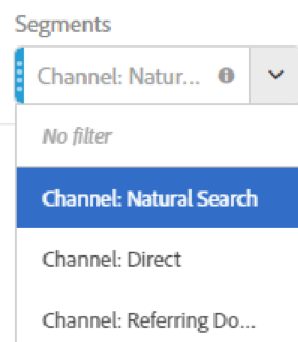
Drag the segment you want for the drop-down to the top of the workspace. To create the dropdown, place the segments on top of one another while holding down the Shift button.

You will end up with a drop-down of the segment options. This can be useful when you don’t want to include every breakdown on the dashboard, but you do want to make sure it is easy for users to explore those breakdowns if they choose.
When building dashboards in Adobe Analytics, there are some simple stylistic tips and tricks that can make your visualizations cleaner, more intuitive and easier to read. As Adobe continues to roll out new updates, there will be even more opportunities to improve your visualizations in the future.


