One of the funny things about working in web usability is that you become very sensitive to how unusable many things are (i.e. physical things, not just web sites).

Long ago, I wrote about my experience with a microwave oven. Today I’d like to mention another of my pet usability peeves: the “One Touch” Control on my Holmes window fan.

Fan controls should be really simple, right? Just three buttons: off, low and high. Or one toggle switch that cycles between off, low and high.

No, no… that would be too obvious and wouldn’t give the manufacturer bragging rights about exciting features!

So the engineers at Holmes decided to throw a thermostat into the mix. (Why I don’t know; it’s a FAN, not an air conditioner.)

Much worse, they decided to have all functions (on/off, high/low, plus 5 temperature settings) controlled by a single push button. Apparently the engineers/designers were very proud of themselves, as they boast about this “feature” with a “1-Touch” sign below the button.

It’s the most unusable system imaginable. Toggling through off/high/low with a single button would have been okay. (You’d never be more than two button presses from where you want to be.) But because they combined the thermostat control into the same button, the user is forced to toggle through all the thermostat settings… even if he doesn’t want to use the thermostat!

The two speed settings are multiplied by five, giving ten different settings. Plus “off”, making eleven. So it’s not “one touch” at all. It’s more like eleven touch. (The movie This is Spinal Tap comes to mind: “My fan goes to eleven!”)

To be fair, the engineers did add an alternate way to turn the fan off. You can just hold the button down. But since you have to hold it down for about a WEEK, the less patient of us would rather toggle. Then of course we get frustrated and start pressing too fast… and we pass the setting we wanted… and since there’s no going backwards, we have to start all over again… meaning it’s 22 touches… oops missed it again… now 33 touches… Grrrrr.

So what can we learn from this usability travesty? At least two things.

First, think twice about adding unnecessary features (like a thermostat in a fan). And second, think eleven times before combining two different feature controls into a single button.

Anyone want to buy a slightly used fan?

Message Sent

Thank you for registering.

Cardinal Path hosted a live session to connect with you and answer all your questions on Google Analytics.
Get all the expertise and none of the consultancy fees in this not-to-be-missed, rapid-fire virtual event.

Thank you for submitting the form.

Thank you for submitting the form.

Message Sent

Thank you for registering.

Message Sent

Thank you for registering.

Message Sent

Thank you for registering.

Message Sent

Thank you for registering.

Message Sent

Thank you for registering.

Message Sent

Thank you for registering.

Message Sent

Thank you for registering.

Message Sent

Thank you for registering.

Message Sent

Thank you.

Click here to download access the tool.

Message Sent

Thank you for registering.

Message Sent

Thank you.

Message Sent

Thank you.

Message Sent

Thank you

Message Sent

Thank you

Message Sent

Thank you.

Message Sent

Thank you

Message Sent

Thank you.

Message Sent

Success!
Your message was received.

Thank you.

Thank you for registering.

Cardinal Path is continuing with its series of free training. Next we are conducting training on Google Data Studio. Check it out here.

Message Sent

Thank you for registering.

Thank you for your submission.

Your request has been submitted and a rep will reach out to you shortly.

Message Sent

Thank you for your interest.

Thank you for registering.

You should receive a confirmation email from GoToWebinar with your unique webinar login information. If you do not receive this email or have trouble logging in to the event, please email asmaa.mourad@cardinalpath.com.

Thank you for subscribing!

You're now looped into the world's largest GMP resource hub!

Thank you for your submission.

Thank you for your submission.

Thank you for your submission.

Thank you for your submission.

Message Sent

Thank you for registering.

Message Sent

Thank you for your submission.

Thank you for your submission.

Message Sent

Thank you for registering.

Thank you for registering.​

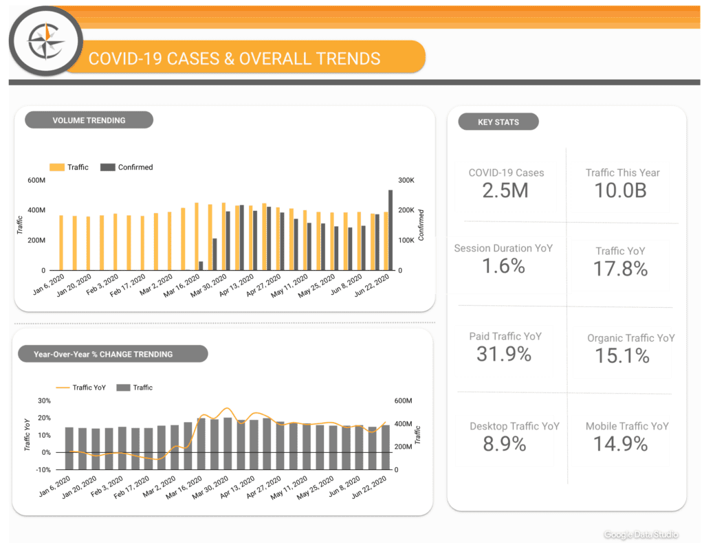
Paid media spend by Government websites increased a whopping 139% YoY in 2020.

2020 Online Behavior Live Dashboard

Message Sent

Thank you for registering.

Message Sent

Thank you for registering.

Message Sent

Thank you for registering.

2020 Online Behavior Live Dashboard

Thank you for your submission.

Message Sent

Thank you for registering.

Message Sent

Thank you for registering.

Message Sent

Thank you for registering.

Message Sent

Thank you for registering.

Message Sent

Success! Thank you
for reaching out.