Do you frequent any online forums? Have you noticed that for ease-of-use, forums are typically much worse than other (e.g. Ecommerce) websites? Why is this?
First, there fewer established conventions on forums. One clear example is the placement of the Search feature. On most websites, a prominent search box appears somewhere in the upper right of every page.
On forums, the Search can be anywhere. Typically it’s is on its own page (i.e. no search box is persistently visible) and you have to find “Search” in the navigation to access it.
But one problem really stands out. I’ve seen it on virtually every forum I’ve visited. It’s this: New users can’t figure out how to add photos to their posts.
Every day, I see “For Sale” ads with no photos. Other members will reply with posts like, “We need to see some photos, dude!”
And the original poster, obviously embarrassed, will reply meekly with something like, “I tried to upload one, but it wouldn’t let me” or “How do I add photos? I can’t see where to do that.”
Why do so many users have trouble with this? Is there some technical compatibility issue? Is it a security problem? Are users just dumb??
No. The problem is the developers, not the users. In wording their instructions, the developers make two mistakes:
- Using technically precise GeekSpeak where they should be using everyday language.
- Accommodating everything users might want to do, where they should be focusing on what users probably want to do. (See my post on “Designing for probabilities“.)
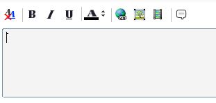
Let me illustrate. When you’re adding a post on a forum, you’re typically presented with a text entry box. Above the box will be a bunch of tools:
If a newbie user wants to upload a photo to his post, he’ll probably look for the “photo” icon in the toolbar.
But many users are stumped. Because on most forums, if you click the “photo” icon, you’re asked for a URL. And of course, many users won’t have a URL for their photo; they’ll just have the photo on their computer somewhere.
They were really expecting a “file selection” box. And if they don’t have a website they can quickly upload a photo to, they give up.
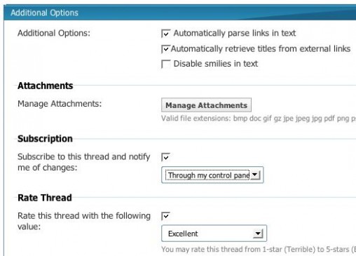
In reality, users can upload photos directly from their computers. But the instructions are so vague and poorly located, users don’t realize this.
Typically, the file upload function appears well below the text entry box, mixed in with a bunch of other rather mysterious stuff. Even worse, it’s almost always labeled “Manage Attachments”.
“Manage Attachments”? What an awful label. Sure, it’s technically accurate (because you can also upload and re-use text files, word documents, videos and other types of attachments). But it doesn’t reflect how normal users think or speak.
Almost always (on the forums I visit, anyway) it’s photos that users want to upload. So why not label the function something like:
- Upload Photo
- Add Photo
- Insert Photo
Sure, for advanced users, you’ll want to allow uploads of other files types somewhere. But make “Upload Photos” front and center. (And if on a given forum, videos are a common upload, make “Upload Video” prominent.)
Really… “Manage Attachments”? Can’t we do better?


