Brain Katz approaches my desk – smiling lightly, shaking his head in disbelief. I know what this means: He’s come across a woefully unusable website and is dying to share it with me…

“Go ahead. Make my day.”

He does. This time, it’s www.oakley.com. The sunglasses people.

Pretty, to be sure. And if you like black, wow have you found your website. But if you actually want to read text, be prepared to strain.

I guess we should cut Oakley some slack. Their products are the epitome of trendy. So on their website, image and branding should trump usability. In fact, for Oakley, an Amazon-like experience would be wrong.

Still, even on a fashion-oriented website like Oakley, shouldn’t there be some concession to usability?

This is the first time I’ve ever seen a black-on-black search box. It’s a good thing it’s properly located (at top right) or nobody would stand a chance of finding it.

Even if you do find it, it’s ridiculously hard to use. As you type, text is barely legible. How do you spot errors?

To Oakley’s credit, once you enter their Store, usability improves. But their Home page — and the other branding pages — are classic examples of image trumping usability.

What are your favorite examples? If you stumble across a funny case of “user be damned”, please post a comment below. We can learn a lot about good usability by examining bad usability.

Your request has been submitted and a rep will reach out to you shortly.

Message Sent

Thank you for your interest.

Thank you for registering.

You should receive a confirmation email from GoToWebinar with your unique webinar login information. If you do not receive this email or have trouble logging in to the event, please email asmaa.mourad@cardinalpath.com.

Thank you for subscribing!

You're now looped into the world's largest GMP resource hub!

Thank you for your submission.

Thank you for your submission.

Thank you for your submission.

Thank you for your submission.

Thank you for your submission.

Message Sent

Thank you for registering.

Thank you for your submission.

Message Sent

Thank you for registering.

Thank you for registering.​

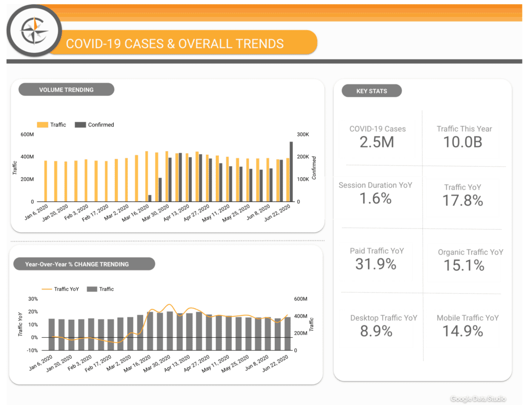
Paid media spend by Government websites increased a whopping 139% YoY in 2020.

2020 Online Behavior Live Dashboard

Message Sent

Thank you for registering.

Message Sent

Thank you for registering.

Message Sent

Thank you for registering.

2020 Online Behavior Live Dashboard

Thank you for your submission.

Message Sent

Thank you for registering.

Message Sent

Thank you for registering.

Message Sent

Thank you for registering.

Message Sent

Thank you for registering.

Message Sent

Thank you for your submission.

Message Sent

Thank you for registering.

Thank you for registering.

Cardinal Path is continuing with its series of free training. Next we are conducting training on Google Data Studio. Check it out here.
Cardinal Path hosted a live session to connect with you and answer all your questions on Google Analytics.
Get all the expertise and none of the consultancy fees in this not-to-be-missed, rapid-fire virtual event.

Thank you for submitting the form.

Thank you for submitting the form.

Message Sent

Thank you for registering.

Message Sent

Thank you for registering.

Message Sent

Thank you for registering.

Message Sent

Thank you for registering.

Message Sent

Thank you for registering.

Message Sent

Thank you for registering.

Message Sent

Thank you for registering.

Message Sent

Thank you for registering.

Message Sent

Thank you for registering.

Message Sent

Thank you.

Click here to download access the tool.

Message Sent

Thank you for registering.

Message Sent

Thank you.

Message Sent

Thank you.

Message Sent

Thank you

Message Sent

Thank you

Message Sent

Thank you.

Message Sent

Thank you

Message Sent

Thank you.

Message Sent

Success!
Your message was received.

Thank you.

Message Sent

Success! Thank you
for reaching out.